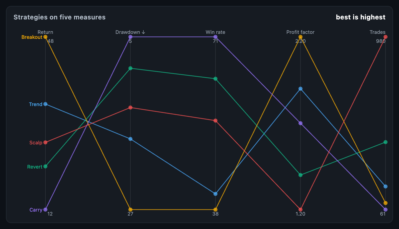
ParallelChart compares many things on many measures at once: one axis per
measure, one line per thing, each crossing every axis at its own value.
Comparing strategies on return, drawdown, win rate, expectancy and trade count
in one picture is what this chart is for.
ParallelChart(
  axes: const [
    ParallelAxis(label: 'Return'),
    ParallelAxis(label: 'Drawdown', inverted: true),
    ParallelAxis(label: 'Win rate'),
  ],
  lines: const [
    ParallelLine(label: 'Trend', values: [34, 18, 41]),
    ParallelLine(label: 'Revert', values: [21, 9, 63]),
  ],
);
The chart fills its constraints. In a box with no height it takes
defaultHeight.
Each axis has its own scale, since the measures are in different units.
min and max set it; left out, the axis takes the smallest and largest
value among the lines. A measure every line agrees on lands in the middle of
its axis rather than at an end.
inverted flips an axis so small is at the top — set it wherever small is
good, like drawdown or latency. Then the best line is the highest line on
every axis, and a reader can compare shapes without reading a single scale.
An inverted axis is marked with a ↓ after its name.
parallelScales(axes, lines) works the scales out on its own and returns a
ParallelScale per axis, whose fractionOf(value) is 0 at the bottom of the
axis and 1 at the top, flipping included.
A ParallelLine is a label and one value per axis, in the axis order. A null
value is a measure the thing has none of, and its line breaks there rather
than dropping to the floor.
Lines are straight by default; curved eases them between axes. lineOpacity
keeps a crowded chart readable, and dotRadius puts a dot at each crossing.
layOutParallel(axes, lines, size:, ...) is the layout on its own, without a
widget. It returns a ParallelLayout with the plotRect, the axisX of each
axis, the scales, and a ParallelLineLayout per line holding an Offset?
per axis and the whole line as a path with a break at every missing value.
layout.yOf(axis, value) places a value, layout.axisAt(x) finds the nearest
axis and layout.lineAt(point) the nearest line on it. progress reveals the
axes left to right, for a draw-in animation.
onLineTap is called with a line and the axis under the finger, and with nulls
when the touch leaves. The held line is drawn over the rest and the others fade
unless fadeUntouched is off. A card names the line, the axis and its value
there; tooltipBuilder replaces it.
| Field | Default |
|---|---|
palette |
Eight colours, handed out by position |
lineWidth, lineOpacity, dotRadius |
1.6, 0.75 and 3 |
axisColor, axisWidth |
A faint vertical line per measure |
showHeaders, headerHeight, headerStyle |
The measure names |
showEnds, footerHeight, endStyle |
Each axis' two ends, written |
showLegend |
Names every line at the left-hand axis |
animationDuration, animationCurve, animateOnMount |
The draw-in |
semanticLabel is what a screen reader announces for the chart.