
A web motion library with live controls and copy-ready code.
English · 한국어 · 日本語 · 简体中文 · 繁體中文 · Русский · Italiano



Live demo · Module reference · Usage and quality matrix · Integrations · Troubleshooting · AI prompt guide · Feature contract
Kineto provides 55 modules for motion, media, scroll, text, and UI.
Use a single data-kt-* attribute or control the same feature through the
JavaScript API.
Unsupported environments disable the effect while keeping the content intact.
Using an AI coding tool? The AI prompt guide includes canonical English project instructions and a Korean usage guide. Agents modifying this repository must also follow the AI handoff.
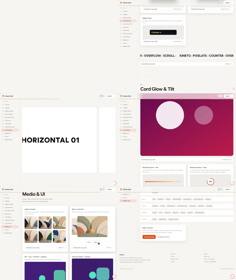
Tune every effect in the live demo, then copy the resulting HTML, Vanilla JavaScript, React, Vue, or CSS-variable snippet.
Progressive Print — Blur and fine noise clear as the image sharpens.

Card Glow — A spotlight, surface reflection, and border glow follow the pointer.

Text Transition — Swap phrases with slide, blur, dissolve, shimmer, or a springy per-letter pop.

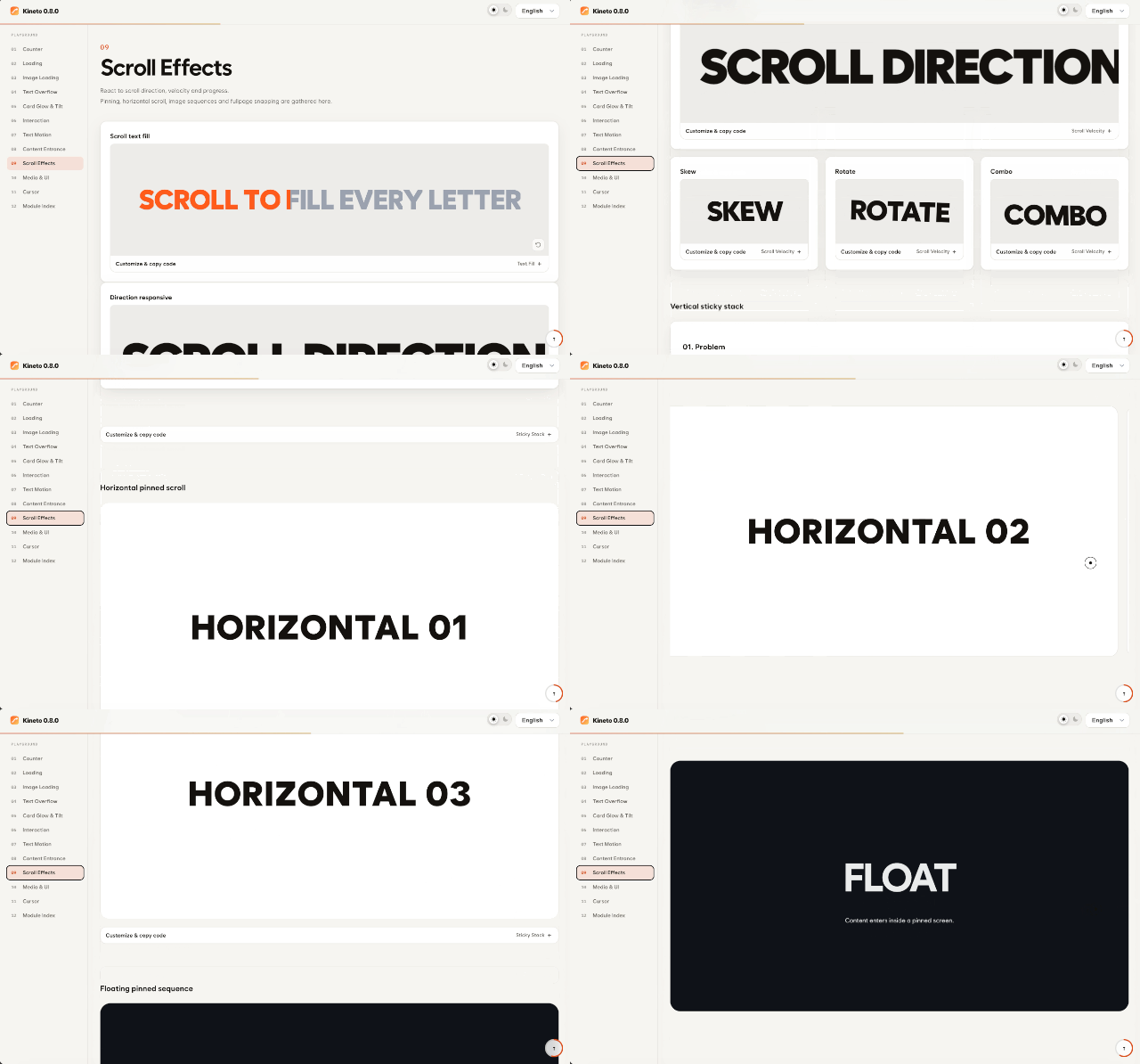
Scroll Velocity — Move, rotate, or transform elements with scroll speed and direction.
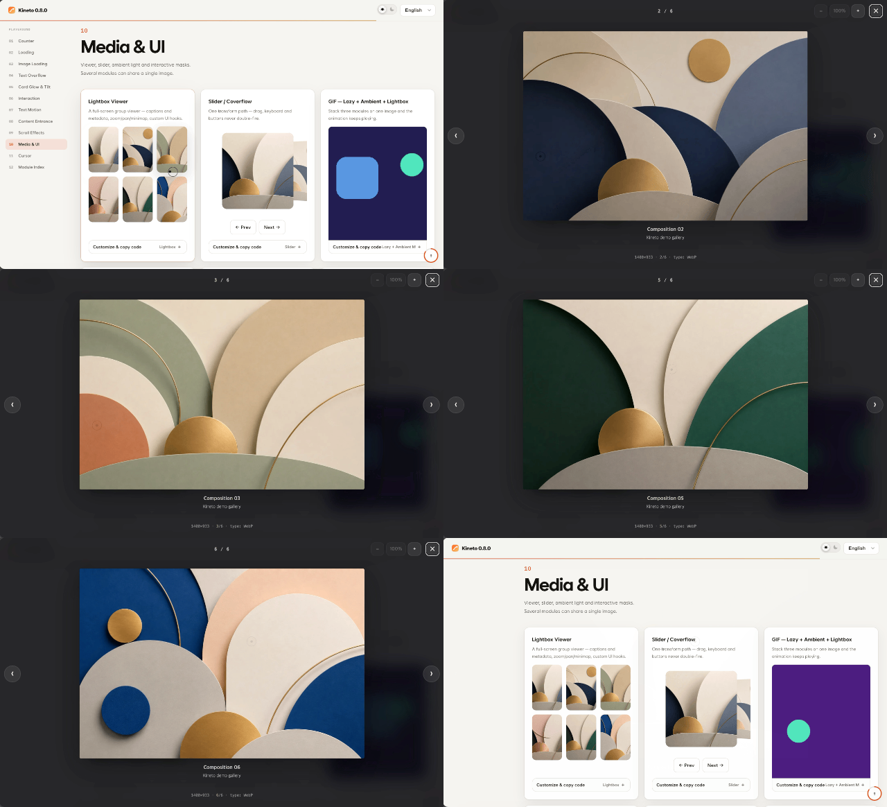
Lightbox — A full-screen viewer with groups, zoom, pan, and a minimap.
See the full module list below for all 55 modules.
npm install @dong-gri/kinetoImport the core and register the modules the page actually uses. Each module brings only its own code; the others are never downloaded.
import Kineto from '@dong-gri/kineto/core';
import reveal from '@dong-gri/kineto/modules/reveal';
import counter from '@dong-gri/kineto/modules/counter';
import '@dong-gri/kineto/style.css';

Kineto.register('reveal', reveal);
Kineto.register('counter', counter);
Kineto.autoInit(); // scans data-kt-* once the DOM is ready
core is about 15 KB gzip; what each module adds on top is listed in
docs/module-cost.md (median about 2 KB), and whole-app
measurements for Vite and Rolldown are in
docs/consumer-bundle-size.md. A data-kt-*
attribute whose module is not registered does nothing — that is expected; see
modular imports and
troubleshooting.
Every data-kt-* module works with no registration, and only the modules the
markup uses are downloaded — each one when it is first needed.
import Kineto from '@dong-gri/kineto/auto';
import '@dong-gri/kineto/style.css';

Kineto.observe(); // scans now and follows later DOM changes
For the JS API, wait for the module first:
await Kineto.loadModules('tilt'); Kineto.tilt('.card').
@dong-gri/kineto/all registers every module at once — the simplest path for a
landing page or a prototype, at the cost of the full bundle (about 169 KB gzip).
import Kineto from '@dong-gri/kineto/all';
import '@dong-gri/kineto/style.css';

Kineto.autoInit();| Entry | First download | Registers | Use it for |
|---|---|---|---|
@dong-gri/kineto/core + /modules/<name> |
core + what you import | only what you register | the smallest bundle, full control |
@dong-gri/kineto/auto |
core + a name → import() table | every module, imported on demand | product pages that use data-kt-* markup |
@dong-gri/kineto/all |
full runtime | every module, up front | prototypes, landing pages, JS API everywhere |
@dong-gri/kineto (default) |
full runtime | same as /all |
changes in 1.0 to behave like /auto |
The default entry is still the full runtime in 0.13, so nothing breaks today. In
1.0 it becomes the on-demand core: choose an entry explicitly now. With
Kineto.config({ debug: true }) the default entry reports this once as a
KT_DEPRECATED diagnostic. Details and migration:
docs/entry-points.md.
Everything in one script tag:
<link rel="stylesheet" href="https://cdn.jsdelivr.net/npm/@dong-gri/kineto/dist/kineto.min.css">
<script src="https://cdn.jsdelivr.net/npm/@dong-gri/kineto/dist/kineto.umd.min.js"></script>
<script>
  Kineto.autoInit();
</script>
Only the modules you use, as native ES modules (pin a version in production,
e.g. @dong-gri/kineto@0.12):
<link rel="stylesheet" href="https://cdn.jsdelivr.net/npm/@dong-gri/kineto/dist/kineto.min.css">
<script type="module">
  import Kineto from 'https://cdn.jsdelivr.net/npm/@dong-gri/kineto/dist/modular/core.js';
  import reveal from 'https://cdn.jsdelivr.net/npm/@dong-gri/kineto/dist/modular/modules/reveal.js';

  Kineto.register('reveal', reveal);
  Kineto.autoInit();
</script>
The full package as one ES module: import Kineto from 'https://cdn.jsdelivr.net/npm/@dong-gri/kineto/+esm';
import { Motion } from '@dong-gri/kineto/react';
import '@dong-gri/kineto/style.css';

export const Title = () => <Motion as="h2" type="textReveal">Hello</Motion>;
import { createApp } from 'vue';
import KinetoVue from '@dong-gri/kineto/vue';
import '@dong-gri/kineto/style.css';
createApp(App).use(KinetoVue).mount('#app');The adapters import the full entry (see Framework adapters).
A React or Vue app that only renders data-kt-* markup can skip the adapter and
use the modular core path above instead — call Kineto.observe(root) once so
elements rendered later are picked up. Do not mix the two in one app: core and
the full entry are separate registries.
Everything works from HTML attributes alone.
<h2 data-kt-text-reveal="stream">Text that streams in</h2>
<strong data-kt-counter="pop" data-kt-to="98760" data-kt-format=",">98,760</strong>
<img data-kt-lazy="skeleton" data-src="./cover.webp" alt="Cover">
<section data-kt-reveal="fade-up">Appears on scroll</section>
The same features are available through the JavaScript API.
Kineto.counter('#total', { preset: 'pop', to: 98760, format: ',' });
Kineto.reveal('.card', { preset: 'fade-up', stagger: 0.06 });
const lightbox = Kineto.lightbox('.gallery img', { group: 'work', minimap: true });Apps that render later — React/Vue trees, Bootstrap toasts and modals,
infinite lists — call observe() once instead of re-running scan() after
every change. It scans the root now, attaches modules to data-kt-* elements
added later (batched per microtask), and destroys the instances of elements
that leave the DOM.
const live = Kineto.observe();            // document by default
// later, on teardown:
live.disconnect();                        // or Kineto.destroy() to drop everything
observe(root, { attributes: true }) also reacts to data-kt-* attribute
changes. The handle is inert (active: false) during SSR, so the call is safe
in shared code.
For repeated visual states, use the small state controller instead of creating a new effect module. It owns opacity, transform, and the limited blur/brightness filter set; DOM removal and accessibility state remain with your component.
const cards = Kineto.states({
  hidden: { opacity: 0, y: 16 },
  visible: { opacity: 1, y: 0 }
});

await cards.apply('.card', 'visible', { initial: 'hidden', stagger: 40 });
// `data-kt-state="visible"` elements can be applied with cards.scan().
apply() returns a Promise with finished/cancelled status and a cancel()
method. Call cards.destroy() to cancel active runs and restore the original
inline styles. See the Motion States RFC for the
scope and boundaries.
Add viewport-fit=cover so loaders and page transitions extend beneath the
iPhone notch and home bar.
<meta name="viewport" content="width=device-width, initial-scale=1, viewport-fit=cover">Kineto does not bundle GSAP or Lenis.
It loads an engine from the CDN only when an effect needs one.
If the page already exposes window.gsap or window.Lenis, Kineto reuses that
instance.
When the CDN is unavailable, the content remains visible and supported effects fall back to native behavior. You can also pin a version, self-host, or use an internal mirror.
Kineto.setEngineSource({
  gsap: 'https://cdn.jsdelivr.net/npm/gsap@3.13.0/dist/gsap.min.js',
  scrollTrigger: 'https://cdn.jsdelivr.net/npm/gsap@3.13.0/dist/ScrollTrigger.min.js',
  lenis: 'https://cdn.jsdelivr.net/npm/lenis@1.1.0/dist/lenis.min.js',
  gsapIntegrity: 'sha384-...',
  scrollTriggerIntegrity: 'sha384-...',
  lenisIntegrity: 'sha384-...'
});
The pinned default CDN files use SHA-384 subresource integrity. When overriding an engine URL, provide the matching integrity value or self-host the file under your own origin.
To manage the engines yourself, load them before Kineto initializes.
<script src="https://cdn.jsdelivr.net/npm/gsap@3/dist/gsap.min.js"></script>
<script src="https://cdn.jsdelivr.net/npm/gsap@3/dist/ScrollTrigger.min.js"></script>
<script src="https://cdn.jsdelivr.net/npm/lenis@1/dist/lenis.min.js"></script>
Smooth scroll is off by default and opt-in at runtime.
Kineto.enableSmooth({ lerp: 0.08 });
Kineto.disableSmooth();| Module | Activation attribute | Purpose |
|---|---|---|
accordion |
data-kt-accordion |
Accessible <details> accordion, CSS-customizable arrow |
ambientMedia |
data-kt-ambient-media |
Ambient glow sampled from media |
blurText |
data-kt-blur-text |
Per-character blur reveal |
bottomSheet |
data-kt-bottom-sheet |
Draggable bottom sheet with focus trap |
brushReveal |
data-kt-brush-reveal |
Pointer brush-mask reveal / scratch card |
cardGlow |
data-kt-card-glow |
Pointer spotlight, surface sheen, luminous border |
confetti |
data-kt-confetti |
Click / view confetti burst |
counter |
data-kt-counter |
Number count, flip, clock, countdown |
dateTime |
data-kt-date-time |
Relative and absolute server timestamps |
coverReveal |
data-kt-cover-reveal |
Color cover wipe reveal |
cssScroll |
data-kt-css-scroll |
Scroll bound to CSS vars / scroll & view timeline |
cursor |
data-kt-cursor |
Eleven custom cursor presets |
drag |
data-kt-drag |
Drag with inertia, bounds, snap-back, keyboard |
flip |
data-kt-flip |
FLIP layout animation on reorder / add / remove |
fullpage |
data-kt-fullpage |
Fullpage section paging (x / y / mixed axis) |
gesture |
data-kt-gesture |
whileHover / whileTap spring feedback |
glitch |
data-kt-glitch |
RGB slice and glitch reveal |
hold |
data-kt-hold |
Hold / mash-to-confirm gauge |
horizontalScroll |
data-kt-horizontal-scroll |
Pinned horizontal scroll section |
lazy |
data-kt-lazy |
Image / video load effects (skeleton, blur-up, pixelate, print, dissolve) |
stylize |
data-kt-stylize |
Dither / ASCII / halftone canvas filter for images and video |
lightbox |
data-kt-lightbox |
Full-screen viewer, groups, zoom, minimap, filmstrip |
loader |
data-kt-loader |
Loader bound to real progress sources |
loadingIndicator |
data-kt-loading-indicator |
Inline spinner, bar, shimmer, and symbol indicators |
magnetic |
data-kt-magnetic |
Magnetic pointer response |
marquee |
data-kt-marquee |
Continuous marquee |
megaMenu |
data-kt-mega-menu |
GNB dropdown / mega menu (keyboard + aria) |
mouseParallax |
data-kt-mouse-parallax |
Pointer / gyroscope parallax |
overflowText |
data-kt-overflow-text |
Ways to handle overflowing text + item scenes |
pageReveal |
data-kt-page-reveal |
Page-entry overlay |
pageTransition |
data-kt-page-transition |
Same-origin page transitions |
parallax |
data-kt-parallax |
Scroll parallax |
progress |
data-kt-progress |
Reading progress bar / ring |
reveal |
data-kt-reveal |
Scroll-entry reveal |
ripple |
data-kt-ripple |
Click ripple |
scrollSequence |
data-kt-scroll-sequence |
Image-sequence scrubbing |
scrollShadows |
data-kt-scroll-shadows |
CSS edge shadows on scroll containers |
squircle |
data-kt-squircle |
superellipse corners on every browser |
canvasEffect |
data-kt-canvas-effect |
host for your own Canvas 2D / WebGL / shader effects |
scrollVelocity |
data-kt-scroll-velocity |
Scroll speed / direction response |
slider |
data-kt-slider |
Slide, coverflow, stacked, and radial carousel effects |
radial |
data-kt-radial |
Backward-compatible radial carousel entry point |
stickyHeader |
data-kt-sticky-header |
Shrinking / cover-to-fixed sticky header |
stickyStack |
data-kt-sticky-stack |
Sticky stack (vertical / horizontal / floating) |
switch |
data-kt-switch |
Accessible toggle switch (form-usable) |
tabs |
data-kt-tabs |
WAI-ARIA tabs, segmented control |
textFill |
data-kt-text-fill |
Scroll-driven text fill |
textReveal |
data-kt-text-reveal |
Text reveal (incl. Hangul composition) |
textSplit |
data-kt-text-split |
Character / word split motion |
textTransition |
data-kt-text-transition |
Text swap transitions (direction options) |
tilt |
data-kt-tilt |
3D tilt and glare |
toast |
data-kt-toast |
Status toast (role=status/alert) |
tooltip |
data-kt-tooltip |
Accessible tooltip (auto-placement) |
typewriter |
data-kt-typewriter |
Typing effect |
vibrate |
data-kt-vibrate |
Haptic vibration feedback |
For each module's variants and full option list, see the module reference and kineto.features.json.
Kineto ships first-party TypeScript declarations for the full package, modular core/module imports, and the React, Vue, and jQuery adapters. Module options remain open-ended so custom modules and newly introduced options can be used without casts.
import { Motion } from '@dong-gri/kineto/react';
<Motion as="h2" type="textReveal" options={{ mode: 'hangul' }}>Hello</Motion>
import KinetoVue from '@dong-gri/kineto/vue';
app.use(KinetoVue);Adapter option updates use an explicit replacement policy. React recreates the
module only when type or a value in dependencies changes; Vue's
useKineto() does the same for watchSources, and v-motion replaces the
instance when its binding changes. Vue accepts an options object, ref, or
getter; use a ref/getter when a replacement must read values that changed after
setup(). The adapter resolves it immediately before every create. Cleanup
always runs before the replacement.
The adapters do not guess whether an individual module supports a partial
updateModule() call. For imperative live updates, retain the returned instance
or call the Core API directly.
Vue's <Transition> can use a Kineto module for one-shot enter/leave motion.
Vue still owns the DOM boundary; the hook calls Vue's done callback from the
module completion event and cleans up the temporary instance after each phase.
import { Transition, h, ref } from 'vue';
import { useKinetoTransition } from '@dong-gri/kineto/vue';

const visible = ref(true);
const transition = useKinetoTransition('reveal', {
  enterOptions: { preset: 'fade-up', duration: 0.35 },
  leaveOptions: { preset: 'fade', duration: 0.2 }
});

// In a render function:
h(Transition, transition, {
  default: () => visible.value ? h('article', 'Panel') : null
});
Use one-shot modules for this bridge. If a custom module does not emit
onComplete, the adapter uses its configured duration + delay as a bounded
fallback so Vue's transition lifecycle cannot remain blocked indefinitely.
import installKineto from '@dong-gri/kineto/jquery';
installKineto(window.jQuery);
$('.card').kineto('reveal', { preset: 'fade-up' });Kineto is built to work next to any framework, design system or component
library — and to fit in rather than take over: the library owns behaviour and
accessibility, Kineto adds motion through the same data-kt-* attributes on
the same elements.
-
shadcn/ui — a shadcn registry serves typed wrappers (
KinetoProvider,KinetoReveal,KinetoCounter,KinetoImage,KinetoPresence, …) and an AI rules item:npx shadcn@latest add https://kineto.dongri.me/r/provider.json https://kineto.dongri.me/r/reveal.json # or, with "@kineto": "https://kineto.dongri.me/r/{name}.json" in components.json registries: npx shadcn@latest add @kineto/provider @kineto/reveal @kineto/ai-rules -
Bootstrap 5, MUI, Mantine, Chakra UI, Ant Design, daisyUI, Nuxt UI, PrimeVue, Vuetify — one guide each in
docs/integrations/: attach pattern, what the library already provides, conflicts to avoid and per-intent recipes. The claims are verified against the real libraries intests/integrations/(SSR → jsdom →Kineto.scan(),Kineto.observe()with React client renders, and a Bootstrap 5 coexistence page driven in a real browser). -
Coding agents —
ai/kineto.rules.md(also served as/llms.txt) tells Claude Code, Cursor or Codex when to use which module, and the Kineto MCP server (npx @dong-gri/kineto-mcp) answerskineto_suggest/kineto_snippet/kineto_validate_optionsfrom the real feature contract. Figma MCP users map layers to intents withkineto_figma_layers; seedocs/integrations/figma-mcp.md.
Everything above is generated from one machine-readable map,
kineto.integrations.json, which is validated
against the feature contract on every CI run.
@dong-gri/kineto/all includes and registers all modules for zero-configuration
use, and @dong-gri/kineto/auto imports each module when markup first uses it
(see Installation). For full control over the bundle, import
the core and only the modules you use:
import Kineto from '@dong-gri/kineto/core';
import sliderModule from '@dong-gri/kineto/modules/slider';
import revealModule from '@dong-gri/kineto/modules/reveal';
import '@dong-gri/kineto/style.css';

Kineto.register('slider', sliderModule);
Kineto.register('reveal', revealModule);
Kineto.scan();
Module entries share code-split runtime chunks. Importing a module does not
register the other modules or download their implementations.
The bytes each module adds on top of core are generated per release in
docs/module-cost.md.
권장 판단은 다음과 같습니다.
- 랜딩 페이지나 짧은 프로토타입:
@dong-gri/kineto/all로 빠르게 시작합니다. - 마크업(
data-kt-*) 중심 제품 페이지:@dong-gri/kineto/auto— 쓰는 모듈만 받습니다. - 번들을 직접 통제하는 제품:
@dong-gri/kineto/core와@dong-gri/kineto/modules/<name>만 가져옵니다. - 기능을 늦게 열어야 하는 경우: 해당 모듈 엔트리를 동적 import하고, 로드가 끝난 뒤
Kineto.register()와Kineto.scan()을 호출합니다.
모듈형 엔트리는 자동으로 다른 모듈을 등록하지 않습니다. 따라서 data-kt-* 속성이
있어도 해당 모듈을 등록하지 않으면 동작하지 않는 것이 정상이며, 이 경우에는
troubleshooting을 먼저 확인하십시오.
Motion States is also available as an opt-in modular entry when the application does not need the full registry:
import Kineto from '@dong-gri/kineto/core';
import states from '@dong-gri/kineto/states';

const cards = states({
  hidden: { opacity: 0, y: 12 },
  visible: { opacity: 1, y: 0 }
});

await cards.apply('.card', 'visible');
The standalone entry shares the same named-state contract and SSR-safe behavior
as Kineto.states(), but does not register the full module set.
Presence is an opt-in modular prototype because it coordinates DOM lifetime and accessibility rather than a visual effect alone:
import presence from '@dong-gri/kineto/presence';

const lifecycle = presence(panel, { mode: 'wait', accessibility: 'managed' });
await lifecycle.enter();
const result = await lifecycle.leave({ duration: 180 });
if (result.status === 'finished') panel.remove();
See the Presence Core RFC for the current contract;
the host still owns DOM insertion and removal. React/Vue consumers should keep
the referenced element mounted until leave() settles; the framework lifecycle
fixture and future adapter release gates are documented in the Presence
framework adapter contract.
Latest Chrome, Edge, Firefox, and Safari (desktop and mobile). With prefers-reduced-motion enabled, every module renders its final state without animation; on unsupported environments the effects degrade to static content.
npm install
npm run build   # emits dist/ (build output, not committed — run it after cloning)
npm run ci      # lint, build, Node/Chromium tests, contract and package checks
npm run verify # full CI suite plus dependency security auditMIT © dongri.me — see LICENSE.
Kineto does not bundle its optional engines. When a page uses them they are loaded from the page or the CDN under their own licenses: GSAP (GreenSock's standard license) and Lenis (MIT).