Repository navigation
fix(core): a card's press overlay paints a finger's press - #8057
Conversation


|
The latest updates on your projects. Learn more about Vercel for GitHub.
|


 meta-cla
Bot
added
the
CLA Signed
 github-actions
Bot
added
the
needs:design-review

|
AI review status for this pull request.
|

9e81a18 to
8615370
Compare


There was a problem hiding this comment.
No changes needed. A held finger on ClickableCard, SelectableCard and an interactive Thumbnail now paints the pressed overlay in layered builds (Storybook and the Vite and PostCSS integrations), with the mouse press's pixels, while mouse states and the prebuilt stylesheet behave as before. The new guard and per-card assertions fail on the base and pass on this branch, and the Chromium contract passes in CI; one optional nit is left inline.
[Automated review]
| * press is painted once, not twice | ||
| * @position Run with `pnpm test:a11y-contract`. Browser layer of the cards' | ||
| * press overlay; the jsdom layer is each card's own test and | ||
| * utils/pressArmLayering.test.ts. |
There was a problem hiding this comment.
Nit: utils/pressArmLayering.test.ts doesn't exist; the jsdom guard this PR adds is utils/customPropertyArmLayering.test.ts.

PR Analysis Report📚 Storybook Preview🧪 Sandbox PreviewModified ComponentsClickableCard (@astryxdesign/core) · View in Storybook
SelectableCard (@astryxdesign/core) · View in Storybook
Thumbnail (@astryxdesign/core) · View in Storybook
Bundle Size Summary
Accessibility AuditStatus: 5 accessibility violation(s) found — 5 serious. Button pattern - 1 issue(s)
Checkbox pattern - 1 issue(s)
ClickableCard - 1 issue(s)
SelectableCard - 1 issue(s)
Thumbnail - 1 issue(s)
Visual Regression46 of 494 shot(s) changed. A change here is a question, not a failure: check whether the after is the
and 26 more. Generated by PR Enrichment workflow | Storybook | Sandbox | View full report |
ClickableCard, SelectableCard and Thumbnail painted the touch press as an
attribute arm of the --_press-overlay custom property. In a layered
stylesheet (Storybook, the Vite and PostCSS integrations) StyleX leaves a
custom property's own declarations unlayered and puts the attribute arm in a
priority layer, so the default always won and a finger's press painted
nothing. The press is now the overlay's own image, keyed on
data-astryx-press as plain ::after properties, with the hover and mouse
colour yielding while it paints. Mouse presses and the precompiled
stylesheet are unchanged.
8615370 to
5b2678b
Compare
There was a problem hiding this comment.
No changes are needed to the fix. A held finger on ClickableCard, SelectableCard and an interactive Thumbnail now paints the pressed overlay in layered builds with the mouse press's pixels, while mouse states and the prebuilt stylesheet are unchanged.
pr-a11y currently fails before it reaches the new card press contract: the job runs main's workflow, whose Lab pinch-zoom step names a spec this branch predates, so rebasing onto main should let it run. One optional wording nit is inline.
[Automated review]
| // The `::after` layer paints the hover and mouse states as its colour, | ||
| // `--_press-overlay`, which their arms set on the element itself (same | ||
| // enabled guard as the shared overlay utility). The press the controller | ||
| // paints (a finger's, and on a touch-first device a mouse's or a key's) |
There was a problem hiding this comment.
Nit (optional): on this branch the press controller ignores mouse pointers (pressFeedback.ts returns early for pointerType === 'mouse') and handles no keys. "on a touch-first device a mouse's or a key's" therefore describes #8046 rather than this change. The same sentence is in SelectableCard.tsx and Thumbnail.tsx. Consider dropping the parenthetical until #8046 lands, or keep it if #8046 lands first.

Brings the branch up to main so pr-a11y can run its card press contract;
main's workflow runs a Lab spec this branch predated.
There was a problem hiding this comment.
Changes requested: the card press fix itself works (a held finger now paints the pressed overlay on ClickableCard, SelectableCard and an interactive Thumbnail in layered builds, and the new contract passes), but the latest merge of main into this branch reverts #8042. On this head Item.tsx is back to touch-action: pan-y, the second-finger hand-off in useSwipeAction.ts is gone, and #8042's changeset, pinch unit tests, ItemSwipePinchZoom.a11y.chromium.spec.ts and its pr-a11y step are deleted, so a pinch that starts on a swipeable row no longer zooms the page; #8042's own Chromium contract fails all four pinch cases against this head. Please redo the merge keeping main's versions of those six paths, which a plain merge of the same two parents does without conflicts.
[Automated review]
| swipeRoot: { | ||
| isolation: 'isolate', | ||
| touchAction: 'pan-y pinch-zoom', | ||
| touchAction: 'pan-y', |
There was a problem hiding this comment.
This line comes from the merge of main, which kept the branch's pre-#8042 Item.tsx: main declares touchAction: 'pan-y pinch-zoom' here. The same merge drops #8042's second-finger hand-off in useSwipeAction.ts, its changeset, its five pinch unit tests, ItemSwipePinchZoom.a11y.chromium.spec.ts and its pr-a11y step; that contract fails all four pinch cases against this head's Storybook. Redoing the merge with main's versions of those paths fixes it, and a plain merge of the same two parents keeps them without conflicts.
| # (WCAG 1.4.4) and leave the row where it is, whichever finger lands | ||
| # first, while a one-finger sideways drag still swipes. Pinch-zoom and | ||
| # touch-action only exist in a real engine with two-finger touch input. | ||
| - name: Run Item swipe pinch-zoom contract |
There was a problem hiding this comment.
This is #8042's pinch-zoom contract step; it should stay beside the new card step, as a plain merge of main keeps both.
…e dropped

The previous merge commit's tree came from an older main than its second
parent, so it reverted Item's swipe pinch-zoom fix (touch-action
'pan-y pinch-zoom', the second-finger hand-off, its tests, changeset and
pr-a11y step). This merge's tree is the clean merge of the branch's own
commit with main, so only this pull request's files differ from main.
Also points the card press contract's header at the jsdom guard that
exists, utils/customPropertyArmLayering.test.ts.
There was a problem hiding this comment.
No changes needed. A held finger on ClickableCard, SelectableCard and an interactive Thumbnail now paints the pressed overlay in layered source builds with the mouse press's pixels, while mouse states are unchanged and the prebuilt stylesheet still paints the press. The new Chromium contract fails its three finger cases against a base build and passes against this head, and the earlier revert of #8042 is gone from this branch.
[Automated review]


…8063) ## User impact On a phone narrower than the drawer, `MobileNav` covered the whole screen: the default 320 px drawer on a 320 px phone left no backdrop to tap, although the `width` prop promises "Capped at 85vw to prevent overflow on small screens". The page the drawer navigates was hidden entirely. ## Problem and solution fit The drawer's width was `width: 100vw; max-width: <width>px`, which is min(100vw, width): the only cap was the viewport itself. A drawer that covers the screen hides its context and takes away the usual way out, a tap beside it; UIKit's overlay sidebar never covers the whole screen. Small phones, zoomed-in text and split-screen windows reach these widths. The fix swaps the two: `width: <width>px; max-width: 85vw`, which is min(width, 85vw). On a 320 px phone the drawer is 272 px wide, and a 48 px strip of the dimmed page stays beside it as a target for the tap that closes it. ## Expected behavior and authority - `MobileNav.doc.mjs`, `width`: "Drawer width in pixels. Capped at 85vw to prevent overflow on small screens." ## Smallest restoration One style function in `MobileNav.tsx`. No API, token or default changes. From 377 px up, 85vw is at least 320 px, so the default drawer is unchanged there. Siblings: #8042, #8046 and #8057 also add `ci.yml` steps, and #7358, #7356 and the close-path fix #8064 touch `MobileNav.tsx`; whichever lands second rebases. ## Evidence Before (`main`) and after, 320 × 568, drawer open: 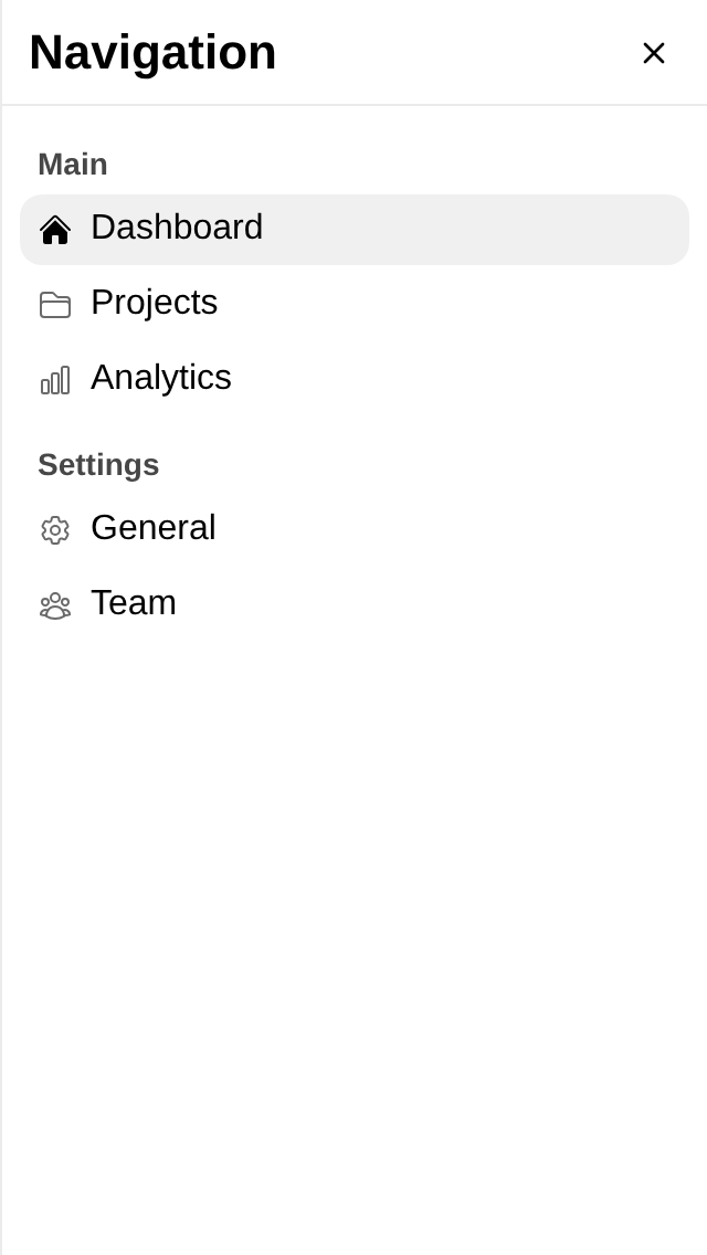 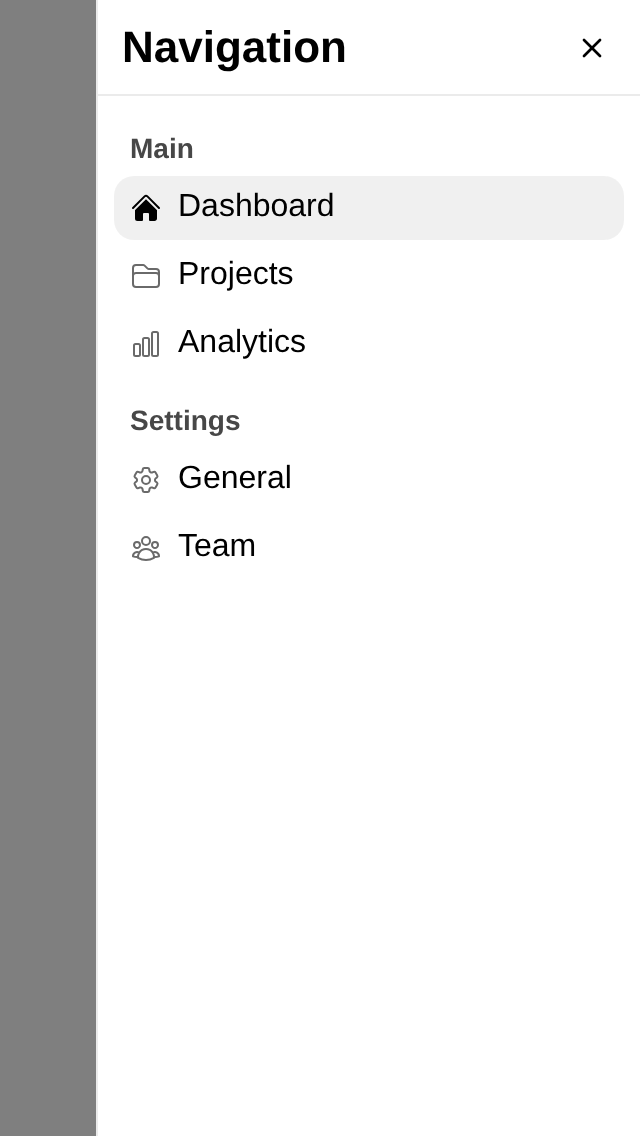 iOS 26.2 simulator, real taps (402 px: the drawer keeps 320 px): a tap on the strip closes it:  - Reproduction before the change: on a 320 px phone the drawer is 320 px wide. The new Chromium contract fails against a `main` Storybook (expected 272, received 320). - Result after the change: a 272 px drawer and a 48 px strip; the strip is backdrop (`elementFromPoint` is the dialog), and a real tap on it closes the drawer. - Representative unchanged path: on a 402 px phone the drawer keeps its 320 px width and the 82 px strip. - Regression test or other mutation-sensitive proof: `MobileNavWidth.a11y.chromium.spec.ts` (real Chromium, touch), plus a jsdom test that the drawer's own class declares `max-width: 85vw` and takes its width from the prop. ## Scope - [x] One defect is restored. - [x] Separable contradictory or unsettled tagalongs were removed or split. - [x] No new public API, visual representation, default, or interaction model is hidden under the bug-fix label. - [x] Public text and artifacts contain no internal Meta context. ## Testing - `pnpm exec vitest run packages/core/src/MobileNav packages/core/src/AppShell`: 136 passed. - `pnpm -F @astryxdesign/core typecheck`; eslint and prettier on touched files; `pnpm check:repo` (pre-commit). - `pnpm exec playwright test packages/core/src/MobileNav/__tests__/MobileNavWidth.a11y.chromium.spec.ts --project chromium` against a fresh Storybook build: 2 passed. Against `main`: the 320 px test fails and the 402 px test passes. - CI: a new "Run MobileNav width contract" step in the a11y contract job, after the Token remove target contract.





User impact
In apps compiling Astryx from source with cascade layers (the Vite and PostCSS integrations, Storybook), a finger held on a ClickableCard, SelectableCard or interactive Thumbnail showed no pressed state; the precompiled stylesheet painted it. Now every build paints it on the first frame and fades it at the lift; mouse states are unchanged.
Problem and solution fit
'--_press-overlay': {default: 'transparent', '[data-astryx-press="on"]': …}). StyleX's layered output leaves its lowest priority group (every custom property's own declarations) unlayered and puts attribute arms in a priority layer. Unlayered wins whatever the specificity, so the default always won.Plain
::afterproperties keyed on the attribute now paint it, outranking the defaults in layered and flat stylesheets alike.Expected behavior and authority
data-astryx-press="on").usePressFeedbackdocs: a marked surface paints the pressed token on the first frame of a believed press and fades it over the release.Smallest restoration
--_press-overlay-transitiongo; on the press arms the::aftergetsbackground-image: var(--_press-paint-image),background-color: transparent(so a fine pointer's:activecannot paint twice) andtransition-property: none.ci.ymlwith fix(core): a mouse or Space press on a touch-first device paints the pressed state #8046; whichever lands second rebases.Evidence
onand the card stays white.:active(229, not 206).Scope
Testing
pnpm vitest run packages/core/src/ClickableCard packages/core/src/SelectableCard packages/core/src/Thumbnail packages/core/src/utils/customPropertyArmLayering.test.ts packages/core/src/theme/derivedVarRegistry.test.ts, and the full core unit suite.pnpm exec playwright test packages/core/src/__tests__/CardPress.a11y.chromium.spec.ts --project chromium: 9 passed; 3 fail on the base build, and a build without the colour yield fails the:activecase with a double paint. Wired intoci.yml. "a desktop mouse is unchanged: hover,:active, release, leave" (per card) passes on the base build and here.data-astryx-press="on"is written and the::afterpaints nothing; after, it paints the pressed token and clears 200 ms after the lift. Text selection is off on the story root to keep iOS's long-press selection out of the frame. This is the WebKit leg: the contract's touch input is CDP, which only Chromium has.pnpm build:css: the flat stylesheet orders the new arms above their defaults.pnpm -F @astryxdesign/core typecheck,pnpm check:changesets, CI routing tests, lint and prettier on touched files.