Repository navigation
Conversation


|
The latest updates on your projects. Learn more about Vercel for GitHub.
|


 meta-cla
Bot
added
the
CLA Signed

|
AI review status for this pull request.
|


PR Analysis Report📚 Storybook Preview🧪 Sandbox PreviewComponent Size
Sizes are gzip. Import counts the JavaScript the import loads eagerly; CSS counts the package stylesheet rules referenced by the modules it can load from its own package, lazily loaded ones included. Bundle Size SummaryGzip figures measure each package's entry file, not the code an import pulls in.
Accessibility AuditStatus: No accessibility violations detected. Visual Regression55 of 504 shot(s) changed. A change here is a question, not a failure: check whether the after is the
and 35 more. Generated by PR Enrichment workflow | Storybook | Sandbox | View full report |


There was a problem hiding this comment.
Approval waits on an owner decision. No current spec admits typography.dynamicType, its generated iOS font-size layer or the <html data-astryx-text-size> attribute, and letting the phone profile follow the reader's text size changes design:mobile-typography DR1 and DR2. An engineering owner needs to provide or identify the governing records (amend DR1 and DR2, and admit the field, the layer and the attribute) and record the decision by commenting /approve-spec <full head SHA> on this pull request; the author may do this as an engineering owner. Whatever the decision, three changes are still needed:
- Rebase once #8052 and #8053 land, so the diff carries only this pull request's own commit; today it is 3,018 authored lines.
- Make the hierarchy cap hold below Large: with the Dense preset (12, 1.125) at
xs, supporting text computes to 10.15px against 9.88px body text (dynamicType.ts:202). - Keep
dynamicTypeout of the adaptation rules' typography type, where it type-checks but has no effect (themeAdaptations.ts:78).
[Automated review]
| name, | ||
| next === undefined | ||
| ? scaled | ||
| : `min(${scaled}, max(var(${next}), ${value}))`, |
There was a problem hiding this comment.
Below Large every scale is at most 1, so max(var(${next}), ${value}) holds this cap at the step's own size, and a step can end up larger than the one above it. With the Dense preset (12, 1.125) at xs, supporting text computes to 10.15px against 9.88px body text. Capping by var(next) itself whenever the theme's own value doesn't exceed the next step's (true for every generated ramp) keeps the hierarchy at every category, and a tight-ramp case in the hierarchy test would cover it.
| * height, so at the accessibility sizes their labels can overflow. | ||
| * @default false | ||
| */ | ||
| dynamicType?: boolean; |
There was a problem hiding this comment.
ThemeAdaptationTypographyConfig extends Omit<TypographyConfig, 'scale'>, so this field also type-checks inside adaptations.rules[].value.typography, where completeTypography drops it and no Dynamic Type CSS is emitted. Omitting dynamicType there too, or rejecting it at construction, would stop a phone-only opt-in from silently doing nothing.
There was a problem hiding this comment.
Approval waits on an engineering owner's decision: no current spec admits typography.dynamicType, its generated iOS font-size layer or the always-written <html data-astryx-text-size> attribute and probe, and letting the phone profile follow the reader's text size changes design:mobile-typography DR1 and DR2. An engineering owner needs to provide or identify the governing records (amend DR1 and DR2, and admit the field, the layer and the attribute) and record the decision by commenting /approve-spec <full head SHA> on this pull request; the author may do this as an engineering owner. Whatever the decision, three changes are still needed:
- Rebase once #8052 and #8053 land, so the diff carries only this pull request's own commits; today it is 3,032 authored lines.
- Make the hierarchy cap hold below Large: with the Dense preset (12, 1.125) at
xs, supporting text computes to 10.15px against 9.88px body text (dynamicType.ts:202). - Keep
dynamicTypeout of the adaptation rules' typography type, where it type-checks but has no effect (themeAdaptations.ts:78).
[Automated review]
73a14ec to
d85e22c
Compare
There was a problem hiding this comment.
Approval waits on an engineering owner's decision: no current spec admits typography.dynamicType, its generated iOS font-size layer or the always-written <html data-astryx-text-size> attribute and probe, and letting the phone profile follow the reader's text size changes design:mobile-typography DR1 and DR2. An engineering owner needs to provide or identify the governing records (amend DR1 and DR2, including whether display sizes stay uncapped and whether readers below Large drop under the 16px base, and admit the field, the layer and the attribute) and record the decision by commenting /approve-spec <full head SHA> on this pull request; the author may do this as an engineering owner. The two defects from the previous round are fixed, and two changes are still needed whatever the decision:
- Rebase once #8053 lands (or drop its branch from this one), so the diff carries only this pull request's own commits; today it is 3,188 authored lines, 2,039 of them from #8053.
- Report the base-against-head gzip size of the root
Theme's import, asarchitecture:component-style-authoringINV6 asks; it grows by about 1.3 KB gzip, under the 2 KB touch-only budget.
[Automated review]
d85e22c to
5652454
Compare
 github-actions
Bot
added
the
needs:design-review
There was a problem hiding this comment.
Approval waits on an engineering owner's decision: no current spec admits typography.dynamicType, its generated @supports (font: -apple-system-body) font-size layer or the always-written <html data-astryx-text-size> attribute and probe, and following the reader's text size on phones changes design:mobile-typography DR1 and DR2. An engineering owner needs to provide or identify the governing records (amend DR1 and DR2, including whether display sizes stay uncapped and whether readers below Large drop under the 16px base, and admit the field, the layer and the attribute) and record the decision by commenting /approve-spec <full head SHA> on this pull request; the author may do so as an engineering owner. Whatever the decision, three changes are still needed:
- Rebase once the #8076 stack lands, or drop it from this branch: the diff is now 31,248 authored lines, 30,020 of them from that stack.
- Mark the
typographydeclaration@experimental, list it in theuikitnamespace doc and add an[experimental]Changeset line, or stop re-exporting it frommotion/uikit/index.ts, since it now reaches@astryxdesign/core/motion/experimentalwithout those markers (AST-017 FR21 and FR22). - Report
Theme's base-against-head gzip import size, asarchitecture:component-style-authoringINV6 asks.
[Automated review]
| * SYNC: When modified, update /packages/core/src/theme/dynamicType.ts | ||
| */ | ||
|
|
||
| export const typography = { |
There was a problem hiding this comment.
typography reaches @astryxdesign/core/motion/experimental through export * as uikit (motion/experimental.ts:71). That namespace export is tagged @experimental, but its doc lists only the springs, scroll, timing, navigation, gesture and haptic tables, and this declaration has no @experimental of its own, unlike every sibling domain (springs.ts:63, timing.ts:31, navigation.ts:31, scroll.ts:26) and unlike the entry's rule that every exposed declaration carries one. AST-017 FR21 asks declarations to carry the marker, and FR22 wants an [experimental] Changeset naming the addition. Add @experimental here, list the table in the namespace doc and add the Changeset line, or keep the table out of uikit/index.ts and import it directly in theme/dynamicType.ts.

5652454 to
de34f72
Compare
There was a problem hiding this comment.
Approval waits on an engineering owner's decision: no current spec admits typography.dynamicType, its @supports (font: -apple-system-body) font-size layer or the <html data-astryx-text-size> attribute and probe the root Theme writes whether or not a theme opts in, and following the reader's text size on phones changes design:mobile-typography DR1 and DR2. An engineering owner needs to provide or identify the governing records (amend DR1 and DR2, including whether readers below Large drop under the 16px base while inputs keep their 16px floor and whether display sizes stay uncapped, and admit the field, the layer and the attribute) and record the decision by commenting /approve-spec <full head SHA> on this pull request; the author may do so as an engineering owner. Whatever the decision, one change is still needed:
- Rebase once the #8076 stack lands, or drop it from this branch: the diff is 30,555 authored lines, 29,279 of them from that stack.
[Automated review]
On iPhone and iPad, readers pick a text size in Settings and UIKit apps
follow it, each text style on its own curve. Mobile Safari reveals the
choice only through the font: -apple-system-* keywords; the root font
size stays 16px, and Astryx never changes it.

The root Theme now measures font: -apple-system-body in a hidden probe
on iOS WebKit, names the reader's category from Body's size, and keeps
<html data-astryx-text-size> on it, rereading when the probe resizes so
a change made while the page is open applies at once. A theme with
typography.dynamicType re-declares, inside a supports query for iOS WebKit,
each raw font-size step as its own value times the scale of the UIKit
text style it plays (UIFontMetrics' rule for custom fonts), at the root
and inside every adaptation rule that writes them. Every scale is 1 at
Large, the default, so default readers see the theme's own sizes, and
only font sizes move. A step never outgrows the step above it, so the
theme's hierarchy holds at the largest accessibility sizes, where
UIKit's smaller styles grow faster than its larger ones.

The point sizes per text style and category are theme data
(theme/uikitTypography.ts), measured on the iOS 26.2 simulator and
confirmed against Safari's own keywords; every row names its sources,
and dynamicType.test.ts checks them.
The story's readout now says when the page was loaded next to the text
size it is following, at a fixed small size, so a text size change made
with the page open visibly restyles it without a reload. The samples
are fewer and shorter (one line each, without the Large text line), so
the whole story fits above Safari's toolbar on an iPhone at the largest
accessibility size, where the toolbar grows too.
…namicType

Below Large, UIKit's Body shrinks faster than its Footnote (17 to 14
against 13 to 12 at xs), and each step's cap, min(scaled, max(var(next),
own)), never went below the step's own size, which is above its scaled
size whenever the scale is under 1. So on a tight ramp the cap never
bound and a step passed the one above it: with the dense starting point
(12, 1.125) at xs, supporting text was 10.15px against 9.88px body text.
A step whose own size is no larger than the next one's, as in every ramp
typography.scale generates, is now capped at the next step's scaled size
alone; at Large that is its own size, so nothing moves there. The
guarded form stays for a ramp that is out of order. The hierarchy test
now evaluates the emitted expressions for four ramps at every category;
it failed for the dense ramp before.

ThemeAdaptationTypographyConfig inherited dynamicType from the theme's
typography config, so an adaptation rule could set it and type-check
while the rule's typography dropped it. It is a setting of the whole
theme: a rule's own scale follows the reader's text size whenever the
theme does. A type test covers it; it failed before.
Dynamic Type rescaled only the twelve raw font-size steps. A theme that
fixes a semantic size at a length kept it there: Butter, Stone and Y2K
set supporting text to 12px, so under them supporting text and every
Badge label stayed 12px at every text size while body text tripled at
AX5. Y2K has no phone rule, so that held everywhere; Butter and Stone's
phone rule turns supporting text back into a step, so it held on iPads
1024px and wider.

A semantic size fixed at a length (12px, 0.75rem, a clamp() of them) now
scales on the curve of the step its core default reads: supporting text
reads --font-size-sm, so it scales like Footnote. A size that reads a
variable follows what it reads, and one in em or % follows its parent,
so neither scales twice. The Dynamic Type CSS comes after the theme's
own rules, so each adaptation rule's block re-declares the sizes that
rule sets through a variable once an earlier block scaled them: Butter's
phone rule keeps its step on phones.

A FixedSupportingSize story shows Y2K's supporting text following the
reader.
|
Both reports are in the description now.
Also fixed since your review: a semantic size a theme fixes at a length (the 12px supporting text of Butter, Stone and Y2K) now follows the reader on the curve of the step it reads by default. |
There was a problem hiding this comment.
Approval waits on an engineering owner's decision: no current spec admits typography.dynamicType, its @supports (font: -apple-system-body) font-size layer, or the <html data-astryx-text-size> attribute and probe the root Theme adds whether or not a theme opts in, and letting the phone profile follow the reader's text size changes design:mobile-typography DR1 and DR2. An engineering owner needs to provide or identify the governing records (amend DR1 and DR2, including whether readers below Large drop under the 16px base beside inputs that keep their 16px floor, whether display sizes stay uncapped and whether iPad layouts outside the mobile condition scale too, and admit the field, the layer, the step-to-style map and the attribute with its probe), and record the decision by commenting /approve-spec <full head SHA> on this pull request; the author may do so as an engineering owner. Whatever the decision, one addition is still needed: a CLI-built parity check for a dynamicType theme, which architecture:theme-compilation asks of any change to how a theme becomes CSS.
[Automated review]
| * content size category (Dynamic Type), from xSmall to AX5 | ||
| * @position Theme data: theme/dynamicType.ts scales a theme's own type scale | ||
| * on these curves when the reader changes their text size. It lives with | ||
| * the theme rather than among the motion tables (motion/uikit): every page |
There was a problem hiding this comment.
This header (and line 25 here, and dynamicType.test.ts:163) describes the table against motion/uikit and motion/uikit/uikit.test.ts, which do not exist on main or in this branch. Rewording these comments so they stand on their own keeps the next reader from looking for them.
There was a problem hiding this comment.
Reworded in abef964: the header of uikitTypography.ts and the test in dynamicType.test.ts now state the source rule themselves (Apple's documentation, a WWDC session, WebKit's own source, or a measurement naming its subject, the iOS version and the date), with no reference to motion/uikit.
| * writes them. Nothing else changes, and at Large every scale is 1. See | ||
| * dynamicType.ts. | ||
| */ | ||
| function generateDynamicTypeCSS(theme: DefinedTheme): string { |
There was a problem hiding this comment.
architecture:theme-compilation's change coupling asks any change to how a web theme becomes CSS to be tested through CLI-built output too. packages/cli/clients/cli/commands/build-theme.adaptations.test.mjs already compares runtime and built CSS for adaptive themes; adding a typography: {dynamicType: true} theme there, with one adaptation rule and a fixed --text-supporting-size, would cover this layer and its inheritance through a built theme.
There was a problem hiding this comment.
Added in 8983825: build-theme.adaptations.test.mjs now builds a typography: {dynamicType: true} theme with a fixed --text-supporting-size and a phone rule through astryx theme build. The built CSS carries the reader text size layer after the authored rule, with the fixed size scaled, and the built module keeps the flag: it, and a theme extending it with a fixed --text-body-size, compile to the same CSS as the source.
The theme compiler's change coupling asks any change to how a theme
becomes CSS to be tested through CLI-built output too. A theme with
typography.dynamicType, a fixed supporting size and a phone rule now
builds with the CLI: the built CSS carries the reader text size layer
after the authored rule, the fixed size scales, and the built module
keeps the flag, so it and a theme extending it compile to the same CSS
as the source.
There was a problem hiding this comment.
Approval waits on an engineering owner's decision. No current spec admits typography.dynamicType, its @supports (font: -apple-system-body) font-size layer and step-to-style map, or the <html data-astryx-text-size> attribute and probe the root Theme adds whether or not a theme opts in, and following the reader's text size changes design:mobile-typography DR1 and DR2 for opted-in themes. An engineering owner needs to provide or identify the governing records (amend DR1 and DR2, including whether phone body text may drop below 16px beside inputs that keep their 16px floor, whether display sizes stay uncapped and whether desktop-width layouts scale too, and admit the field, the layer, the map and the attribute with its probe) and record the decision by commenting /approve-spec <full head SHA> on this pull request; the author may do so as an engineering owner. Whatever the decision, one addition is still needed: a measurement from macOS Safari and from an iPad for the claims that a fixed 13px Body scales nothing on a Mac and that every iPad browser behaves like the measured iPhone (spec:AST-013 FR10), or wording narrowed to what was measured.
[Automated review]
| * macOS Safari knows the keyword too, but its Body is a fixed 13px that names | ||
| * no category, so nothing scales there; other engines do not know it. |
There was a problem hiding this comment.
This describes macOS Safari (a fixed 13px Body, so no category and nothing scales), but the only support is the stubbed jsdom test. spec:AST-013 FR10 asks that a claim about a named browser come from that browser. Either of these would settle it:
- record what
font: -apple-system-bodycomputes in macOS Safari on theCore/Themes/Dynamic Typestory, showing that nodata-astryx-text-sizeis written; - keep this comment and the docs to the measured iPhone behavior.
The same applies to the "every browser on iPhone and iPad" wording, which has no iPad measurement.
They described the table against the motion tables and their test,
which are not on main: the point sizes are theme data, and their source
rule is stated where it is checked.

CI-Rerun: main's gate test (fixed in meta#8406) failed this head's test-node
abef964 to
1c4d182
Compare
There was a problem hiding this comment.
Approval waits on an engineering owner's decision: no current spec admits typography.dynamicType, its @supports (font: -apple-system-body) font-size layer and step-to-style map, or the <html data-astryx-text-size> attribute and probe the root Theme adds whether or not a theme opts in, and following the reader's text size changes design:mobile-typography DR1 and DR2 for opted-in themes. An engineering owner needs to provide or identify the governing records (amend DR1 and DR2, including whether phone body text may drop below 16px beside inputs that keep their 16px floor, whether display sizes stay uncapped and whether desktop-width layouts such as iPad landscape scale too, and admit the field, the layer, the map and the attribute with its probe) and record the decision by commenting /approve-spec <full head SHA> on this pull request; the author may do so as an engineering owner. Whatever the decision, two additions are still needed:
- A measurement from macOS Safari and from an iPad for the claims that a fixed 13px Body scales nothing on a Mac and that every iPad browser behaves like the measured iPhone (
spec:AST-013FR10), or wording narrowed to what was measured. - A server-rendered page measured in iOS Safari through hydration at a non-default text size (
spec:AST-013FR9 and FR10), since the category is written only after hydration.
[Automated review]
| if (isNested || typeof document === 'undefined') { | ||
| return; | ||
| } | ||
| return syncTextSizeCategory(document); |
There was a problem hiding this comment.
The category is written here, in a layout effect, so a server-rendered page first paints at the theme's own sizes and only reaches the reader's size after hydration (at AX5, body text would jump from 16px to 49.88px). spec:AST-013 FR10 asks for real-browser evidence of changes to hydration presentation, and FR9's check is a server render, hydration and post-hydration fixture. Measuring one server-rendered page in iOS Safari at a non-default text size, and saying in the type-scale doc what server-rendered apps should expect, would settle it.

|
Posted by Cindy's agent on her behalf.
Please rework the PR to match. |
…ption or attribute

spec:AST-102 is current: a text size the reader set wins in every theme,
branded included (FR3, DEC-2), and following it adds no theme option,
prop or document attribute (DEC-3).

So typography.dynamicType is gone, and every theme writes its font sizes
following the reader: each raw font-size step it sets is its own value
times the scale of the UIKit text style it plays, capped by the next
step, and a semantic size it fixes at a length is that length times the
scale of the step it reads by default. The scales are private custom
properties that only the root Theme writes, so everywhere else each is 1
and every value is the theme's own; no second set of rules and no
supports query are needed, and an adaptation rule's sizes follow inside
its own condition because it writes them the same way.

The data-astryx-text-size attribute on html is gone too: the root Theme
reads the reader's size from a hidden, empty probe (1em square, no text,
FR1) and adopts a stylesheet holding that category's scales and the core
default steps in their scaled form, in the base layer below every theme,
so a page or a nested theme that sets no type scale follows too, and a
nested theme keeps the outer theme's sizes. Nothing lands on html.

Each role keeps scaling on its own UIKit curve, in order, which is how
FR3's "each role keeps its order" reads. A size the reader set replaces
design:mobile-typography DR1's phone base, smaller or larger, and the
role DR2 pins scales too. The root font size never changes, so the iOS
text-entry floor of 1rem holds.

Tests cover every theme's steps and fixed sizes, a theme with no type
scale inheriting, the missing option, the DR1 and DR2 behavior, the
input floor, and the adopted stylesheet with nothing on html. The theme
compiler's and the CLI build's tests that read raw sizes expect the
scaled form. The CLI search goldens are main's.
vjeux
changed the title
|
Reworked to
The evidence is re-recorded on this head (iOS 26.2 simulator). Cost: every page's |
There was a problem hiding this comment.
Approval waits on an engineering owner's decision about how text scales: spec:AST-102 FR3 and DEC-2 have every theme follow the reader's text size with its roles in order, but no current record says whether each role follows its own iOS text-style curve, as this pull request does (on neutral's phone ramp at AX5, body grows 3.12x, Display 1 1.76x, and Heading 2 meets Heading 1), or one factor that keeps the theme's ratios. An engineering owner needs to settle that curve and the step-to-style map, name the record that states them, and record the decision by commenting /approve-spec <full head SHA> on this pull request; the author may do so as an engineering owner. Whatever the decision, three changes are still needed:
- A theme that aliases a raw step to the step below (such as
--font-size-lg: var(--font-size-base)besidetypography.scale) now compiles to a reference cycle that drops body and smaller text to the inherited 16px in every browser (dynamicType.ts:228-233), so cap a step only by a next step written as a length, leave a step written as a variable as authored, and add a test. - The macOS Safari and iPad claims need evidence from those browsers (
spec:AST-013FR10), or wording narrowed to the measured iPhone. - One server-rendered page needs measuring in iOS Safari through hydration at a non-default text size (
spec:AST-013FR9 and FR10).
[Automated review]
| const inOrder = own !== null && nextOwn !== null && own <= nextOwn; | ||
| return [ | ||
| name, | ||
| inOrder | ||
| ? `min(${scaled}, var(${next}))` | ||
| : `min(${scaled}, max(var(${next}), ${value}))`, |
There was a problem hiding this comment.
A step whose value reads a variable keeps it inside calc(), and the step below caps with var(next). With typography.scale plus --font-size-lg: var(--font-size-base), --font-size-base reads --font-size-lg and --font-size-lg reads --font-size-base, so CSS invalidates both and --font-size-sm and below with them: body, Heading 3 and supporting text fall from 14 / 14 / 12px to the inherited 16px in desktop Chromium with no text size set. Capping a step only by a next step written as a length, and writing a step whose own value reads a variable as authored (as readerTextSizeTokens already does for semantic sizes), plus a test for the aliased case, would avoid it.
| * macOS Safari knows the keyword too, but its Body is a fixed 13px that names | ||
| * no category, so nothing scales there; other engines do not know it. |
There was a problem hiding this comment.
This macOS Safari behaviour (a fixed 13px Body, so nothing scales) and the "every browser on iPhone and iPad" wording above rest on a jsdom stub and one iPhone simulator. spec:AST-013 FR10 asks that a claim about a named browser come from that browser, and spec:AST-102's FR3 verification lists macOS Safari: recording the Core/Themes/Dynamic Type story in macOS Safari and an iPad simulator, or narrowing this comment, the doc and the Changeset to the measured iPhone, would settle it.
| if (isNested || typeof document === 'undefined') { | ||
| return; | ||
| } | ||
| return syncReaderTextSize(document); |
There was a problem hiding this comment.
The scales are adopted here, after hydration, so a server-rendered page on iOS first paints at the theme's sizes and then grows (16px to 49.88px body at AX5). spec:AST-013 FR10 asks for real-browser evidence of a change to hydration presentation: measuring one server-rendered page in iOS Safari at a non-default text size, and saying in the type-scale doc what server-rendered apps show before hydration, would cover it.
| * the theme's own size at Large, a theme emits the scaled sizes only when it | ||
| * opts in (root and adaptation rules, behind the capability alone), and the root sync | ||
| * writes and clears `<html data-astryx-text-size>` |
There was a problem hiding this comment.
This header still describes the removed design: themes no longer opt in, and the root sync no longer writes <html data-astryx-text-size>. The SYNC list in dynamicType.ts:47 also names a generateDynamicTypeCSS that does not exist.
A token written with !important, such as a supporting size of
12px !important or a step of 1rem !important, was wrapped whole, so the
emitted value carried !important inside calc(). That is invalid where
the value is used, so the text fell back to its parent's size in every
browser (20px instead of 12px in Chromium).

The scaling now splits off a trailing !important, scales and order-checks
the bare value, and puts the importance back after the whole expression,
for raw steps and for fixed semantic sizes alike. A test that failed
before covers both paths and the order check across an important step.
There was a problem hiding this comment.
Approval waits on an engineering owner's decision about how text scales: spec:AST-102 FR3 and DEC-2 have every theme follow the reader's text size with its roles in order, but no current record says whether each role follows its own iOS text-style curve, as this pull request does (on neutral's phone ramp at AX5, body grows 3.12x, Display 1 1.76x, and Heading 2 meets Heading 1), or one factor that keeps the theme's ratios. An engineering owner needs to settle that curve and the step-to-style map, name the record that states them, and record the decision by commenting /approve-spec <full head SHA> on this pull request; the author may do so as an engineering owner. Whatever the decision, three changes are still needed:
- A theme that aliases a raw step to the step below (such as
--font-size-lg: var(--font-size-base)besidetypography.scale) still compiles to a reference cycle that drops body and smaller text to the inherited 16px in every browser (dynamicType.ts:221-233), so cap a step only by a next step written as a length, leave a step written as a variable as authored, and add a test. - The macOS Safari and iPad claims need evidence from those browsers (
spec:AST-013FR10), or the comments, doc and Changeset narrowed to the measured iPhone. - One server-rendered page needs measuring in iOS Safari through hydration at a non-default text size (
spec:AST-013FR9 and FR10).
[Automated review]
| const scaled = `calc(${value} * var(${dynamicTypeScaleProperty(FONT_SIZE_STEP_STYLES[name])}, 1))`; | ||
| const next = steps[steps.indexOf(name) + 1]; | ||
| if (next === undefined) { | ||
| return [name, scaled + important]; | ||
| } | ||
| const own = lengthInPx(value); | ||
| const nextOwn = lengthInPx(splitImportant(tokens[next] ?? '')[0]); | ||
| const inOrder = own !== null && nextOwn !== null && own <= nextOwn; | ||
| return [ | ||
| name, | ||
| (inOrder | ||
| ? `min(${scaled}, var(${next}))` | ||
| : `min(${scaled}, max(var(${next}), ${value}))`) + important, |
There was a problem hiding this comment.
A step whose value reads a variable keeps it inside calc(), and the step below caps with var(next). With typography.scale plus --font-size-lg: var(--font-size-base), --font-size-base reads --font-size-lg and --font-size-lg reads --font-size-base, so CSS invalidates both, and --font-size-sm and below fail with them. In desktop Chromium with no text size set, body, Heading 3 and supporting text fall from 14 / 14 / 12px to the inherited 16px. Capping only by a next step written as a length, writing a step whose own value reads a variable as authored (as readerTextSizeTokens already does for semantic sizes), and adding the aliased case to dynamicType.test.ts would avoid it.
…e cycle

The text size scaling wrapped and capped every raw font-size step a
theme wrote, whatever its value. A theme with a type scale that set
--font-size-lg to var(--font-size-base) got a scaled lg reading base
beside a base capped by lg: a reference cycle, so both computed to
nothing and the text fell back to its parent's size, with no reader
size set. A root ramp plus an adaptation rule aliasing lg to base
cycled the same way inside the rule's condition.

Each step a block writes at a fixed length now keeps its scaled size in
a private --_scaled-font-size-* property, and the step reads it. Caps
chain only between those private properties, which only this code
writes and only from fixed lengths, so no cap can read back a variable
a theme wrote, in any block. A step written as a variable or relative
to its parent is emitted as written and follows what it reads, so
nothing scales twice; a step whose next one the same block writes as a
variable is not capped. Every theme that writes fixed steps computes
the same sizes as before.

Tests that failed before cover the alias at the root, the alias in a
rule over a root ramp, and an acyclic check over every step aliased at
the root and in a rule; the expression evaluator now resolves variables
by name and throws on a cycle. The test file's header describes the
current behaviour, with no option and no attribute.
There was a problem hiding this comment.
Approval waits on an engineering owner's decision about how text scales: spec:AST-102 FR3 and DEC-2 have every theme follow the reader's text size with its roles in order, but no current record says whether each role follows its own iOS text-style curve, as this pull request does (on neutral's phone ramp at AX5, body grows 3.12x, Display 1 1.76x, and Heading 2 meets Heading 1), or one factor that keeps the theme's ratios. An engineering owner needs to settle that curve and the step-to-style map, name the record that states them, and record the decision by commenting /approve-spec <full head SHA> on this pull request; the author may do so as an engineering owner. The reference cycle from the previous round is fixed, and whatever the decision, two pieces of evidence are still needed:
- macOS Safari evidence that nothing scales there (and an iPad measurement, or wording narrowed to the measured iPhone), since
spec:AST-102's FR3 verification lists macOS Safari andspec:AST-013FR10 asks for the named browser. - One server-rendered page measured in iOS Safari through hydration at a non-default text size (
spec:AST-013FR9 and FR10).
[Automated review]
…7-dynamic-type

Main's theme compiler now builds each block's token declarations as an
ordered list per caller (the root, each adaptation rule, and the status
role replay), so the text size hook moves into its tokenBlock as
readerTextSizeEntries: it rewrites font sizes in place and keeps every
other declaration's value and position, since a replayed role write
must stay after the alias it overrides.
There was a problem hiding this comment.
Approval waits on an engineering owner's decision about how text scales: spec:AST-102 FR3 and DEC-2 have every theme follow the reader's text size with its roles in order, but no current record says whether each role follows its own iOS text-style curve, as this pull request does (on neutral's phone ramp at AX5, body grows 3.12x, Display 1 1.76x, and Heading 2 meets Heading 1), or one factor that keeps the theme's ratios. An engineering owner needs to settle that curve and the step-to-style map, name the record that states them, and record the decision by commenting /approve-spec <full head SHA> on this pull request; the author may do so as an engineering owner. Whatever the decision, three things are still needed:
- Font sizes a theme writes in
onDarkoronLighttokens skip the scaling (the media-surface token block ingenerateThemeRules.ts), so a theme that sets body text to 16px there keeps it at 16px inside a darkMediaThemeat AX5, beside 43.65px page text; routing those entries throughreaderTextSizeEntries, with a test, would fix it. - macOS Safari evidence that nothing scales there (and an iPad measurement, or wording narrowed to the measured iPhone) is needed, since
spec:AST-102's FR3 verification lists macOS Safari andspec:AST-013FR10 asks for the named browser. - One server-rendered page needs measuring in iOS Safari through hydration at a non-default text size (
spec:AST-013FR9 and FR10).
[Automated review]
| // gives the page its scales (see dynamicType.ts); elsewhere each scale is | ||
| // 1, so the values are the theme's own. | ||
| joinDeclarations( | ||
| readerTextSizeEntries(tokenEntries), |
There was a problem hiding this comment.
Only this block runs readerTextSizeEntries; the onDark/onLight token overrides are joined directly further down (the media-surface block around line 1702), so a font size a theme writes on a media surface stays fixed. With onDark: {tokens: {'--text-body-size': '1rem'}}, body text inside a dark MediaTheme stays 16px at AX5 while the page's body text reaches 43.65px. Passing those entries through readerTextSizeEntries too, with a media-surface case in dynamicType.test.ts, would cover it (spec:AST-102 FR3).
…eader's text size

generateOnMediaCSS wrote a theme's onDark and onLight tokens straight
through, so a size set there, such as a 15px --font-size-base in onDark,
re-declared the raw value on the MediaTheme surface and its text ignored
the reader's text size. The surface's token entries now go through
readerTextSizeEntries, as the root and adaptation blocks do. A test that
failed before covers a step in onDark and a fixed semantic size in
onLight.
There was a problem hiding this comment.
Approval waits on an engineering owner's decision about how text scales: spec:AST-102 FR3 and DEC-2 have every theme follow the reader's text size with its roles in order, but no current record says whether each role follows its own iOS text-style curve, as this pull request does (on neutral's phone ramp at AX5, body grows 3.12x, Display 1 1.76x, and Heading 2 meets Heading 1), or one factor that keeps the theme's ratios. An engineering owner needs to settle that curve and the step-to-style map, identify the record that states them, and record the decision by commenting /approve-spec <full head SHA> on this pull request; the author may do so as an engineering owner. Whatever the decision, three pieces of evidence are still needed:
- macOS Safari evidence that nothing scales there, since the probe and stylesheet run in that browser and
spec:AST-102's FR3 verification lists it. - An iPad measurement, or Changeset and doc wording narrowed to the measured iPhone (
spec:AST-013FR10). - One server-rendered page measured in iOS Safari through hydration at a non-default text size (
spec:AST-013FR9 and FR10).
[Automated review]
| * `font: -apple-system-body`, as every browser on iPhone and iPad does. There | ||
| * is no platform, touch-callout or pointer check, since touch behavior is one | ||
| * on every touch device and this is a style the engine itself provides. | ||
| * macOS Safari knows the keyword too, but its Body is a fixed 13px that names |
There was a problem hiding this comment.
macOS Safari passes this gate too, so the probe and stylesheet run on every desktop Safari page with a root Theme; if its Body ever measures an iOS Body-row size other than 17px, every theme scales on desktop with no reader setting. spec:AST-102 FR3's verification lists macOS Safari and spec:AST-013 FR10 asks for evidence from the named browser: could you record the Core/Themes/Dynamic Type story there (the probe's computed Body size and the theme's unchanged sizes)?
| '@astryxdesign/cli': patch | ||
| --- | ||
|
|
||
| [fix] On iPhone and iPad, text follows the reader's text size (Dynamic Type) in every theme, branded included. Wherever the browser exposes it through `font: -apple-system-body` (all of them on iPhone and iPad), the theme's font sizes scale with the size the reader picked in Settings (Display & Text Size, then Larger Text), each size on the curve of the iOS text style it plays: body text like Body, `heading-1` like Title 1, display text like Large Title, with every role kept in order. A semantic size a theme fixes at a length, such as the 12px supporting text of Butter, Stone and Y2K, scales on the curve of the step it reads by default. At the default size every font size is the theme's own; the family, spacing, line-height ratios and the root font size never change, text inputs keep their 16px floor on iOS, and elsewhere nothing changes. There is no option, prop or document attribute: the root `Theme` reads the reader's size from a hidden element. `astryx docs typography/type-scale` describes it. |
There was a problem hiding this comment.
This says iPhone and iPad, but the measurements come from one iPhone 17 Pro simulator. spec:AST-013 FR10 needs evidence from the browsers a claim names, so either add an iPad measurement or narrow this and the type-scale doc to iPhone.
| if (isNested || typeof document === 'undefined') { | ||
| return; | ||
| } | ||
| return syncReaderTextSize(document); |
There was a problem hiding this comment.
On a server-rendered page this runs after hydration, so an iOS reader first sees the theme's sizes and then the text resizes (16 to 49.88px at AX5 on neutral's phone ramp). spec:AST-013 FR9 and FR10 ask for a real-browser server render, hydration and post-hydration check: could you measure one server-rendered page in iOS Safari at a non-default text size?


Review only this PR's change: vjeux/astryx@71601aa...82390ce
Why
iPhone and iPad readers choose a text size in Settings, and native apps follow it. Astryx pages ignore it: a reader who needs 53px body text still gets 16px.
What led to it
The UIKit-parity work brings iOS behavior to touch screens; Dynamic Type is the setting every iOS app honors.
spec:AST-102sets the rules: no option or attribute, every theme follows, and the reader's size replaces the base size.Options and tradeoffs
<html>, as an earlier version did: callers would have to adopt it, and the spec rules out any public surface.font: -apple-system-bodyon<html>: simplest, but it resets inherited font settings and scales rem spacing too, so layouts would grow along with the text.<html>and spacing stays put. Each text style scales on its own UIKit curve, keeping their order, and sizes fixed at a length (three themes' 12px supporting text) scale like their default step.Why this choice
It follows the reader's setting with no caller work and without growing spacing; at the default size nothing changes. The cost is 1,367 bytes of gzip JavaScript in every page's
import {Theme}, desktop included, no CSS, and one hidden element where the setting exists. Fixed-height controls keep their height, so some labels can overflow at accessibility sizes; #8236 fixes Badge.How to check it
On an iPhone, or the iOS simulator, open the "Core/Themes/Dynamic Type" story:
Evidence
Safari on the iOS 26.2 simulator, neutral theme, in px:
A Settings change restyles the open page: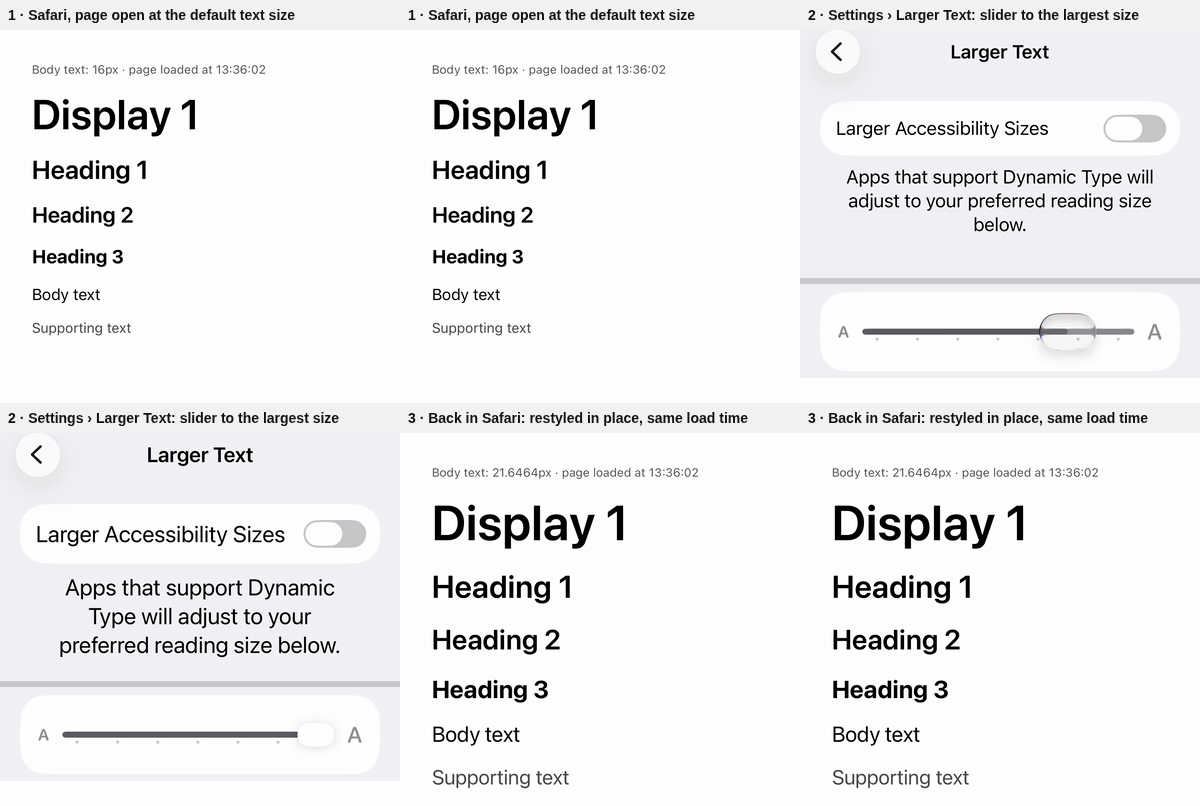
The Node tests' "watch mode forwards the flag to every rebuild" failure is a race in the CLI's theme build, unrelated to this change; #8598 fixes it.