Repository navigation
Conversation


|
The latest updates on your projects. Learn more about Vercel for GitHub.
|


 meta-cla
Bot
added
the
CLA Signed

|
AI review status for this pull request.
|
10923a6 to
44ac0b4
Compare
aa2d881 to
48f4a18
Compare


PR Analysis Report📚 Storybook Preview🧪 Sandbox PreviewNo new or modified components detected. Bundle Size SummaryNo component packages changed. Accessibility AuditStatus: No accessibility violations detected. Visual Regression55 of 502 shot(s) changed. A change here is a question, not a failure: check whether the after is the
and 35 more. Generated by PR Enrichment workflow | Storybook | Sandbox | View full report |


There was a problem hiding this comment.
Changes requested: moving the Swift TextInput onto TextInputProps is what AST-093 FR5 asks for, but two behaviors break current native requirements and FR5's evidence is missing. Please give the clear button, the label tip and the tooltip-variant status button at least a 44-by-44-point tap area (AST-082 FR11; the package's Button already lays out that way), and keep a read-only field a focusable text field that still fires onEnter instead of static text (AST-082 FR3), or record in a TextInput spec why no platform control fits. Then attach simulator captures in light, dark and the largest text size, get the Swift tests running on this head (pull-request CI only runs for main and release/**), and add a two-theme TextInput test.
[Automated review]
| } label: { | ||
| icon("close") | ||
| } | ||
| .buttonStyle(.plain) |
There was a problem hiding this comment.
This button is hit-tested on its 12-point xmark glyph alone, below the 44-point touch minimum AST-082 FR11 requires; tipButton at line 372 has the same problem. Laying the label out at .frame(minWidth: 44, minHeight: 44) with .contentShape(Rectangle()), as Button.swift does, fixes both.
| } | ||
| if isReadOnly { | ||
| // Read-only: the value at full strength, selectable, never editable. | ||
| SwiftUI.Text(props.value) |
There was a problem hiding this comment.
Drawing read-only as Text drops the text-field role and keyboard focus, so .focused and .onSubmit at lines 195-196 never apply and hasAutoFocus and onEnter do nothing; core's read-only input stays a focusable text field that still fires onEnter (AST-082 FR3). A platform text field that refuses edits keeps those, or a TextInput spec can record why none fits.
| } | ||
|
|
||
| private func icon(_ name: String) -> some View { | ||
| Image(systemName: astryx.icon(name) ?? "questionmark") |
There was a problem hiding this comment.
AST-082 FR4 says an unknown icon name draws nothing in a release build; if let symbol = astryx.icon(name), as Banner and Button do, keeps that true. Unreachable for these five built-in names today.
44ac0b4 to
c7c537e
Compare
48f4a18 to
963124c
Compare
There was a problem hiding this comment.
Changes requested: moving the Swift TextInput onto TextInputProps is what AST-093 FR5 asks for, but three behaviors break current native requirements and FR5's evidence is missing. Please give the clear button, the label tip and the tooltip-variant status button a 44-by-44-point tap area (AST-082 FR11), keep a read-only field a focusable text field that still fires onEnter (AST-082 FR3), and announce status messages when they appear or change, as core does (FieldStatus AR1). Then attach simulator captures in light, dark and the largest text size, get the Swift tests running on this head, and add a two-theme TextInput test.
[Automated review]
| ) | ||
| .padding(.top, detached ? astryx.tokens.space.s1 : 0) | ||
| // VoiceOver reads the message on the field. | ||
| .accessibilityHidden(true) |
There was a problem hiding this comment.
VoiceOver users never hear this message when it appears or changes: the box is hidden here and the message only joins the field's hint (line 199). Core announces every status message on first mount and on each change, errors assertively (FieldStatus AR1, and Field for the tooltip variant), so posting an announcement when the message or its type changes keeps AST-082 FR3's announcements on Apple platforms.
c7c537e to
bd51b1b
Compare
963124c to
aab6327
Compare
aab6327 to
63baacc
Compare
There was a problem hiding this comment.
Changes requested: moving the Swift TextInput onto the generated TextInputProps is what AST-093 FR5 asks for, but three behaviors break current native requirements and FR5's evidence is missing. Please give the clear button, the label tip and the tooltip-variant status button a 44-by-44-point tap area (AST-082 FR11), keep a read-only field a focusable text field that still fires onEnter (AST-082 FR3), and announce status messages when they appear or change, as core does (FieldStatus AR1). Then attach simulator captures in light, dark and the largest text size, get the Swift tests running on this head, and add a two-theme TextInput test.
[Automated review]
63baacc to
b6ae2a4
Compare
b6ae2a4 to
71fde4b
Compare
There was a problem hiding this comment.
Changes requested: moving the Swift TextInput onto the generated TextInputProps is what AST-093 FR5 asks for, but the latest push only rebased the branch, so three behaviors still break current native requirements and FR5's evidence is still missing. Please give the clear button, the label tip and the tooltip-variant status button a 44-by-44-point tap area (AST-082 FR11), keep a read-only field a focusable text field that still fires onEnter (AST-082 FR3), and announce status messages when they appear or change, as core does (FieldStatus AR1). Then attach simulator captures in light, dark and the largest text size, get the Swift tests running on this head (pull-request CI only runs for main and release/**), and add a two-theme TextInput test.
[Automated review]
| .onAppear { | ||
| if props.hasAutoFocus == true { isFocused = true } | ||
| } | ||
| .onChange(of: props.isLoading == true) { _, loading in |
There was a problem hiding this comment.
A field that appears with isLoading: true never announces: .onChange(of:) skips the initial value, while core's useBusyAnnouncement also announces a control that mounts busy (AST-086 FR8). .onChange(of: props.isLoading == true, initial: true) covers it.
|
|
||
| /// The note after the label: "Optional" or "Required". | ||
| var labelNote: String? { | ||
| if props.isRequired == true { return AstryxStrings.fieldRequired } |
There was a problem hiding this comment.
With both isOptional and isRequired set, this shows “Required”; core's FieldLabel shows “Optional” in that case and useResolvedRequired drops aria-required. Checking isOptional first keeps the two platforms the same.
71fde4b to
f533de0
Compare
There was a problem hiding this comment.
Changes requested: moving the Swift TextInput onto the generated TextInputProps is what AST-093 FR5 asks for, but a few behaviors still differ from core's contract and the Swift tests have not run for this head. Please announce status messages when they appear or change, give the clear button and both tip buttons a 44-by-44-point tap area, and keep a read-only field a focusable text field that still fires onEnter (AST-082 FR3 and FR11). The smaller fixes fit in the same pass: announce a field that appears already loading, hide the description along with a hidden label, let isOptional win over isRequired, keep a keyboard path to the disabled reason, and draw nothing for an unmapped icon. Then run the Swift tests on iOS and macOS for this head, since pull-request CI only runs for main and release/**.
[Automated review]
| if props.isLabelHidden != true { | ||
| labelRow | ||
| } | ||
| if let description = props.description { |
There was a problem hiding this comment.
With isLabelHidden, this description still draws above the field, while core hides it together with the label and keeps it for screen readers (packages/core/src/Field/Field.tsx: “Hidden when isLabelHidden is true”). Drawing it only while the label row shows, and keeping it in the hint, matches core (AST-082 FR3).
| .foregroundStyle(astryx.tokens.color.textPrimary) | ||
| .focused($isFocused) | ||
| .onSubmit { props.onEnter?() } | ||
| .disabled(isDisabled) |
There was a problem hiding this comment.
.disabled takes the field out of keyboard focus, so a keyboard user cannot reach disabledMessage, which shows only on hover, on a tap and in the VoiceOver hint; family:input-fields FR4 keeps an inactive field with a reason focusable. Refusing edits through text instead of disabling the control keeps it reachable, which the read-only fix also needs.
209d05c to
75da666
Compare

…s; no substitute symbol
…e, announces status, and gives small buttons 44-point targets
…nly field's drawn text; font reads use grouped tokens
…d in type, keeps a disabled field with a reason focusable, shows a read-only placeholder, and gives trailing buttons separate 44-point targets
… the shared Astryx tooltip
…Over reads read-only and disabled fields as the platform's text field
…tion and message stay readable, and it announces and autofocuses only on first appearance
…the record's checks match the tests and it states its canary break
…the record lists every theme value read
…mplate; component API lists TextInput among generated-props views
… disabled TextInput
…ts message, as core's status icon
…me's status roles
… view structure and its focus
d6f0a6a to
df67b58
Compare
There was a problem hiding this comment.
Approval waits on an engineering owner's decision on the new draft record TextInput.spec.md: its requirements (FR1–FR5, AV1 and AR1) need approving or amending, in particular AV1's reason for drawing the read-only and disabled field on macOS, where the record itself calls NSTextField a true read-only field (AST-093 FR2). An engineering owner records that decision by commenting /approve-spec <full head SHA> on this pull request, which the author may do as an engineering owner. Separately, please confirm that a disabled field's reason tooltip opens on keyboard focus, since TextInput.swift:277 attaches it to the field row with the tooltip's control focus mode rather than inside; no other code defect was found.
[Automated review]
| .opacity(isDisabled ? 0.5 : 1) | ||
| // A disabled field shows its reason in the shared tooltip on hover, on | ||
| // keyboard focus, and on a tap; VoiceOver reads the reason on the field. | ||
| .astryxTooltip(isDisabled ? props.disabledMessage : nil, focus: .control, touch: .tap) |
There was a problem hiding this comment.
This row only holds the focusable drawn field, but control is the shared tooltip's mode for "a control that takes focus already"; its inside(Bool) mode exists for a wrapper whose controls take focus, as Thumbnail.swift uses it. With control, the presenter watches only its own .focused($isFocused) on this row, so the reason may never open when Tab lands on the disabled field, which core TextInput FR7 requires ("on hover and keyboard focus"). focus: .inside(focus == .drawn) (or the tooltip on the drawn part) plus a hardware-keyboard check would settle it.
There was a problem hiding this comment.
Approval waits on an engineering owner's decision on the new draft record TextInput.spec.md: its requirements (FR1–FR5, AV1 and AR1) need approving or amending, in particular AV1's reason for drawing the read-only and disabled field on macOS, where the record itself calls NSTextField a true read-only field (AST-093 FR2). Before that decision, please make a disabled field with a status paint the status border, as core TextInput FR9 does (TextInput.swift:313 returns the neutral border whenever the field is disabled). Please also check with Accessibility Inspector that the field row's tooltip, which sets an empty hint, does not hide the field's own VoiceOver hint. A new commit voids an approval, so an engineering owner then records the decision by commenting /approve-spec <full head SHA> on the updated head; the author may do so as an engineering owner.
[Automated review]
|
|
||
| var borderColor: Color { | ||
| let color = astryx.tokens.color | ||
| guard !isDisabled, let status = props.status else { return color.borderEmphasized } |
There was a problem hiding this comment.
A disabled field with a status returns the neutral border here, while its status icon and message stay coloured. Core TextInput FR9 says "A status paints the status border" with no disabled exception, and core paints it (TextInput.tsx:470-472: the status border comes after the disabled border). Dropping !isDisabled from this guard keeps the row's 0.5 opacity dimming it; a pixel check for a disabled field with a status would pin it.
| // A disabled field shows its reason in the shared tooltip on hover, on | ||
| // keyboard focus of its drawn field, and on a tap; VoiceOver reads the | ||
| // reason on the field. | ||
| .astryxTooltip(isDisabled ? props.disabledMessage : nil, focus: reasonTooltipFocus, touch: .tap) |
There was a problem hiding this comment.
This tooltip wraps the whole row with no hint:, so the presenter sets an empty hint on it (TooltipPresenter.swift:556-563), outside the field's own .accessibilityHint(accessibilityDescription) at line 244. If SwiftUI lets that outer empty hint win for the elements in the row, VoiceOver loses the description, "Read only" and the disabled reason. Worth checking the field's hint with Accessibility Inspector; if it is empty, set the field's label and hint outside the tooltip.
… tokens (#8310)

## What changes for people

An iOS developer gets core's whole Button:

- `width: .fill` for a full-width button;
- `href`, which makes the button a real link the system opens and VoiceOver reads as a link;
- `tooltip` as a pointer tip and a VoiceOver hint;
- `elevation` drawn with the theme's shadow;
- `isInterruptible`, so a loading button can still be pressed to interrupt it.

With this, every Swift view that has a core contract takes its generated props, and every view reads the theme through typed tokens. The Login template's Sign in button fills its card through `width: .fill`, as on the web.

## What this does

- `Button` takes the generated `ButtonProps` (AST-093 FR5; Swift component API A2, A3, A4): a labeled initializer with the press last as a trailing closure (`onClick`), and the props initializer.
- Each prop follows core:
  - `href` on an enabled button draws a SwiftUI `Link` styled with the Astryx button style; a disabled one stays a disabled button.
  - A loading link stays a link, focusable and busy, and opens nothing until loading ends unless it is interruptible. The open goes through SwiftUI's `openURL`, so `onClick` runs on every activation: tap, VoiceOver, or keyboard.
  - `tooltip` is SwiftUI's `.help`: a hover tip with a pointer and a hint VoiceOver reads; a tap belongs to the button, as with core's `touchTrigger: auto`.
  - `elevation` draws the theme's shadow; `width` is `content` or `fill`; `size` and `variant` come from typed tokens.
- `AstryxNodeView` also draws Button and TextInput nodes.
- **G9:**
  - Banner and the Login template read typed tokens.
  - The by-name lookups (`astryx.color("…")`, `size`, `space`, `fontSize`, `font(size:…)`) are no longer public.
- **New spec record, `component:swift/Button`** (`packages/native/apple/Sources/Astryx/Button/Button.spec.md`, draft), per Cindy's decision that the loading rule belongs on the Swift Button spec. FR4 holds the loading-link rule: a loading Button with `href` stays a `Link`, keeps focus, shows its spinner, reads as busy, and does not open its destination until loading ends, unless the Button is interruptible, in which case each activation opens it. It never swaps to a button while busy (core Button FR9 and FR11). FR1–FR3 record the initializers, the loading presentation, and enabled or disabled `href`; FR5 says a script URL (`javascript:`, `vbscript:`) or an HTML document in a `data:` URL never opens, and the Button stays an enabled button. FR6: every disabled Button keeps its keyboard focus stop and shows its tooltip on focus, draws dimmed, reads as a dimmed button, and never runs `onClick` (core Button FR10, buttons family FR3); the focus stop is not measured until an app-hosted test can observe it. Each has a verification row. The record names the Apple guideline pages it follows (Buttons, Progress indicators, Accessibility) and the theme values Button reads. The shared component API record keeps no loading rule, only a pointer to Button FR4, and states no general rule. Theme environment's Current state describes the `Astryx` product.
- README: the interim-exemption list is gone; Banner, which has no native contract yet, is the one view with hand-written parameters.

**Landing order:** after #8307 (Card) and #8308 (TextInput); #8305 (Button `width`) is on `main`. This branch carries #8308's commit so it builds; it is rebased onto `main` as each lands, leaving only its own change (8 files).

- `tooltip` shows through the shared Astryx tooltip on hover and keyboard focus, its words the VoiceOver hint; no view uses `.help`.

**Compatibility:** breaking for canary callers. `action:`, `fillsWidth:`, `icon:`, and the hand-written `AstryxButtonVariant` and `AstryxButtonSize` give way to the generated `ButtonProps` (`onClick:`, `width:`, `ButtonVariant`, `ButtonSize`); the record states it.

## Writing rubric results

- R1 present tense: `component:swift/Button` and the component API pointer describe the system as it is.
- R2 research in the record: none.
- R3 evidence naming a change: none. Verification rows name tests, not pull requests.
- R4 rejected alternatives: none.
- R5 user impact first: the record's End-user impact row leads with a width that holds and a link that stays a link.
- R6 open questions: none.

## Captures (AST-093 FR5)

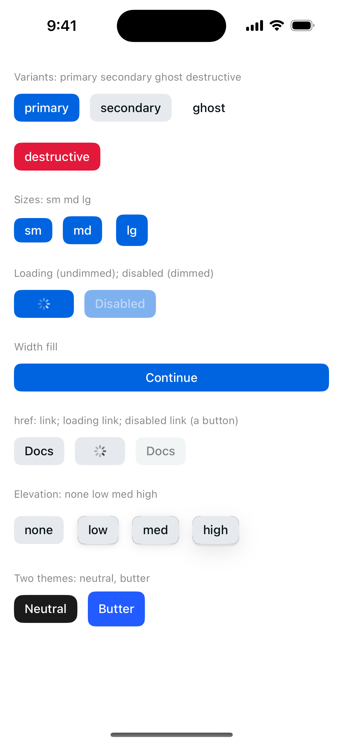
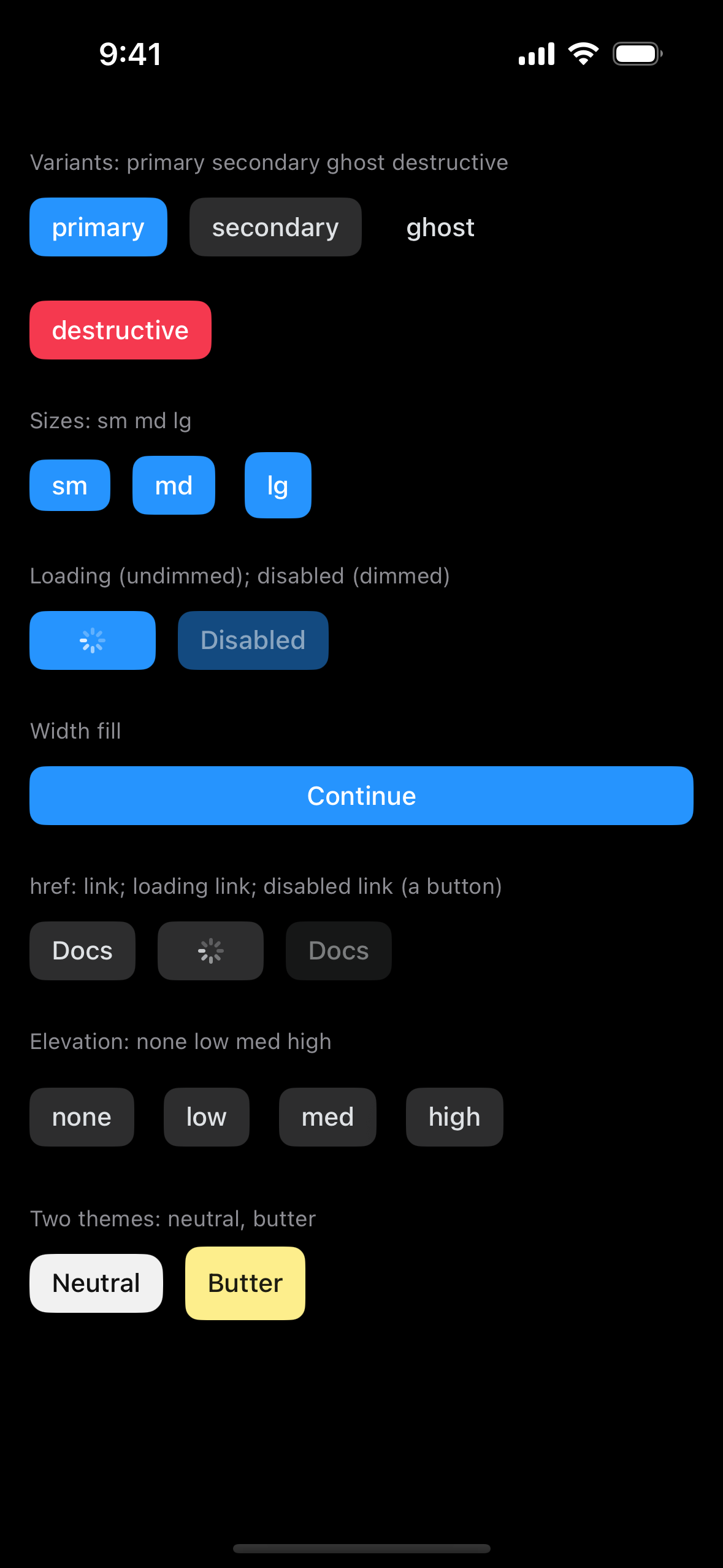
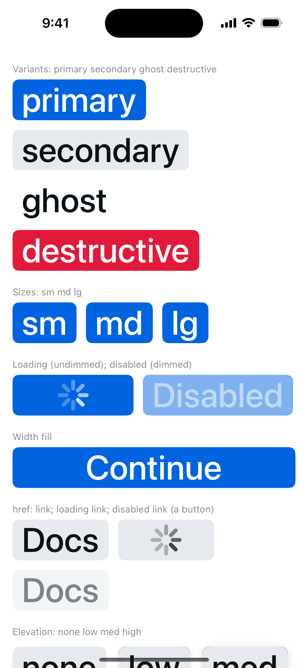
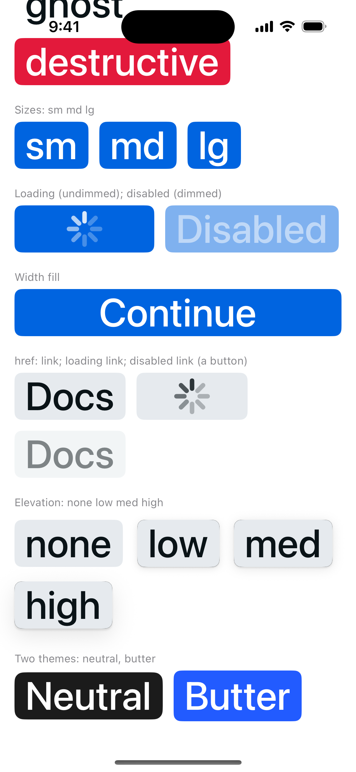
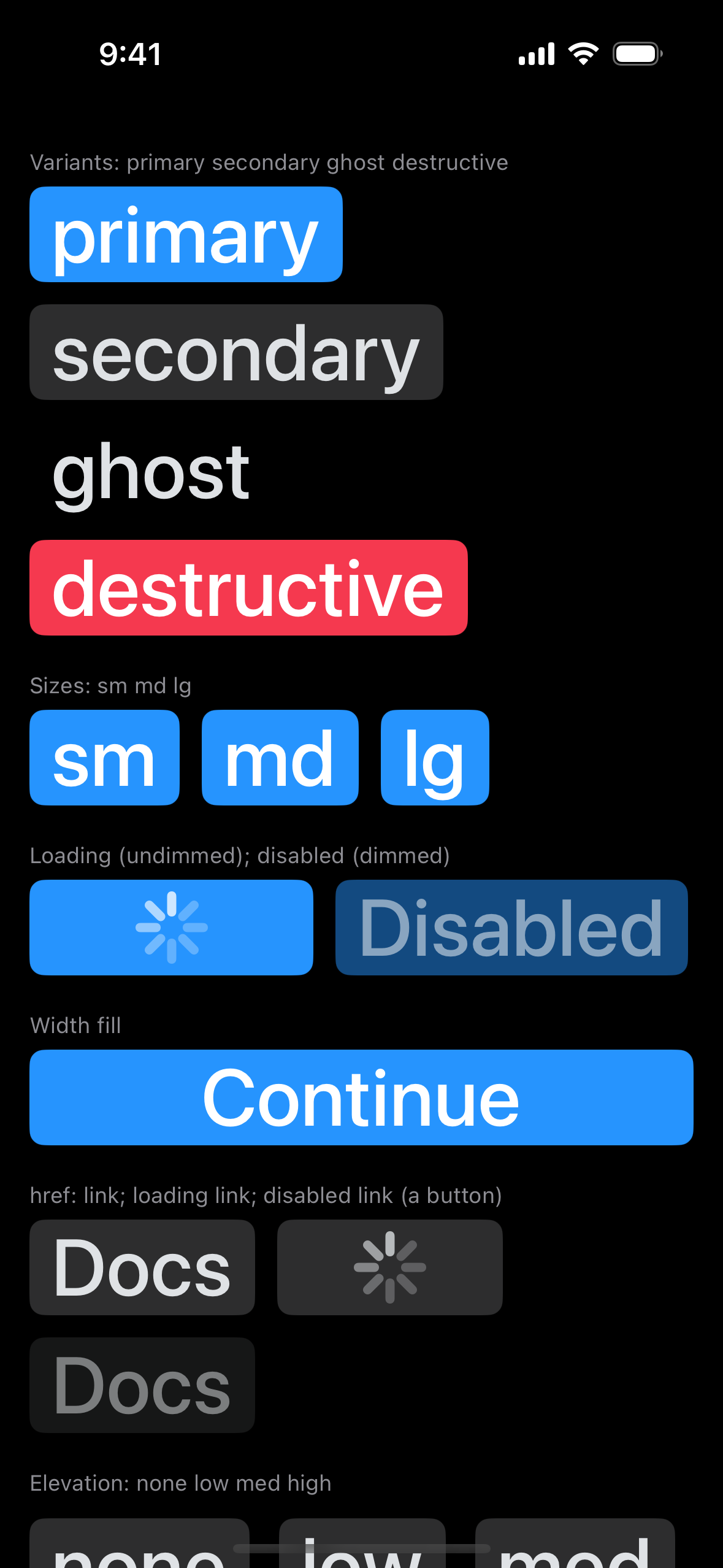
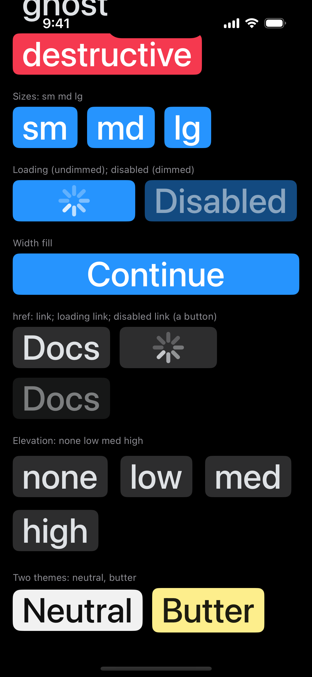
Capture set: iPhone 16 simulator, iOS 18.5, Xcode 16.4, built from this PR's head (`6cad853`). Each capture shows each variant and size, loading and disabled, full width, `href` as a link, loading and disabled links, each elevation, and two themes.

| Light | Dark | Light, largest text | Light, largest text, end | Dark, largest text | Dark, largest text, end |
|---|---|---|---|---|---|
| <img src="https://raw.githubusercontent.com/cixzhang/astryx-pixel-gallery/27f10ad1a94648b64447aba2a1ec79bfe79c13c3/pr-shots/8310/Button-light-large.png" width="150" alt="Button, Light"> | <img src="https://raw.githubusercontent.com/cixzhang/astryx-pixel-gallery/27f10ad1a94648b64447aba2a1ec79bfe79c13c3/pr-shots/8310/Button-dark-large.png" width="150" alt="Button, Dark"> | <img src="https://raw.githubusercontent.com/cixzhang/astryx-pixel-gallery/27f10ad1a94648b64447aba2a1ec79bfe79c13c3/pr-shots/8310/Button-light-ax5.png" width="150" alt="Button, Light, largest text"> | <img src="https://raw.githubusercontent.com/cixzhang/astryx-pixel-gallery/27f10ad1a94648b64447aba2a1ec79bfe79c13c3/pr-shots/8310/Button-light-ax5-end.png" width="150" alt="Button, Light, largest text, end"> | <img src="https://raw.githubusercontent.com/cixzhang/astryx-pixel-gallery/27f10ad1a94648b64447aba2a1ec79bfe79c13c3/pr-shots/8310/Button-dark-ax5.png" width="150" alt="Button, Dark, largest text"> | <img src="https://raw.githubusercontent.com/cixzhang/astryx-pixel-gallery/27f10ad1a94648b64447aba2a1ec79bfe79c13c3/pr-shots/8310/Button-dark-ax5-end.png" width="150" alt="Button, Dark, largest text, end"> |

Accessibility tree: not measured in these captures; the Swift tests check names, traits and values.

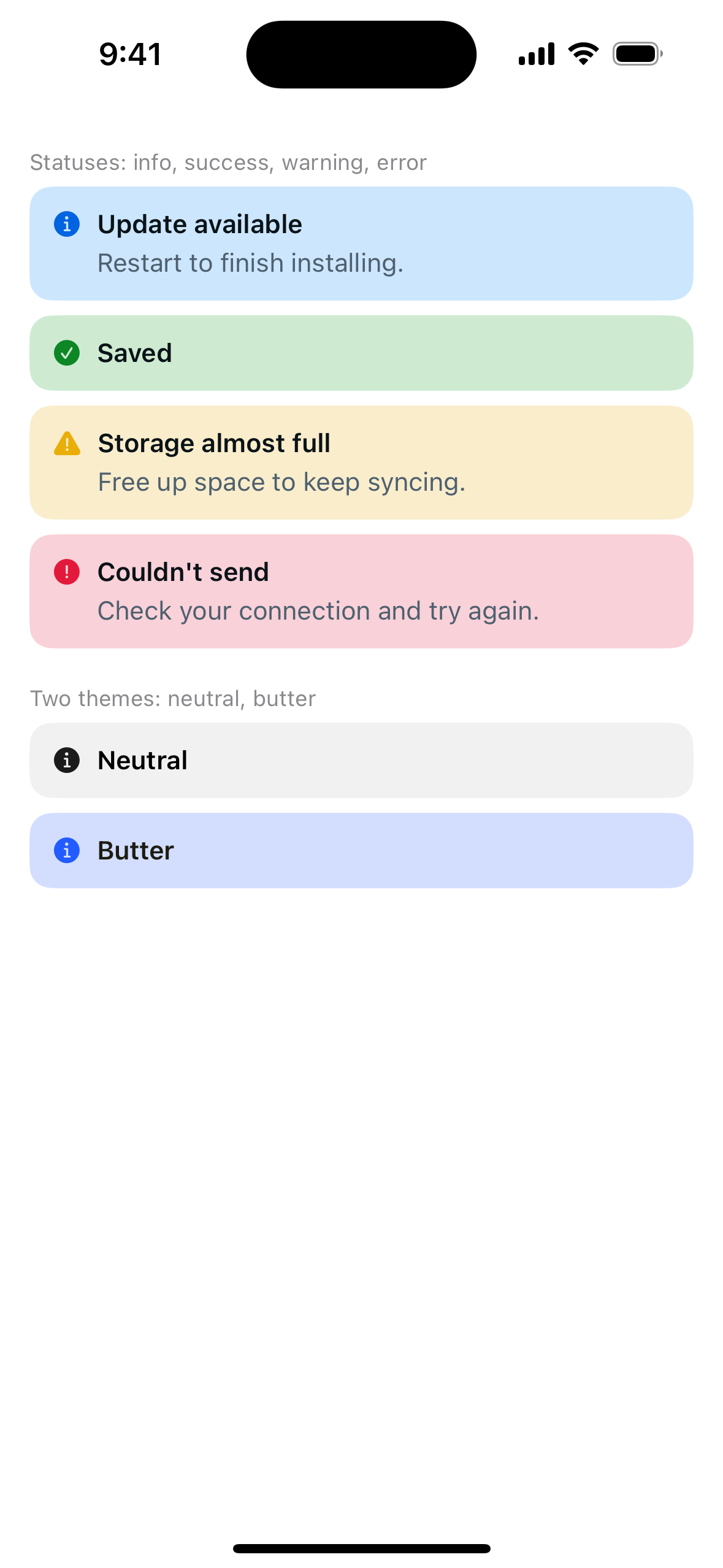
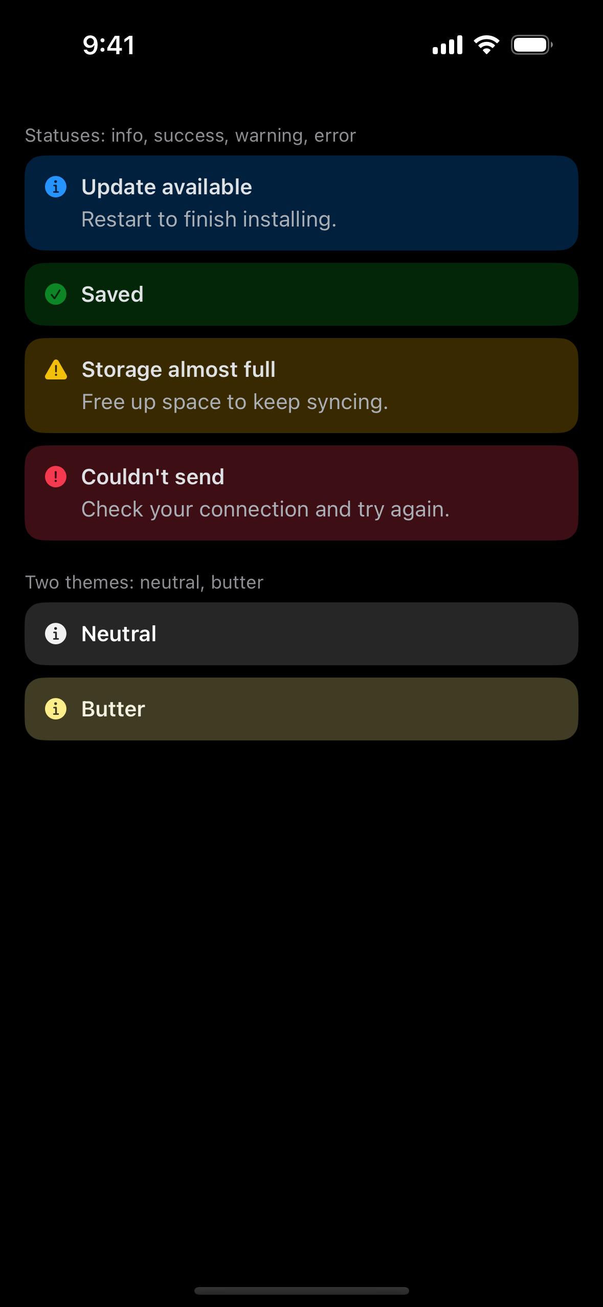
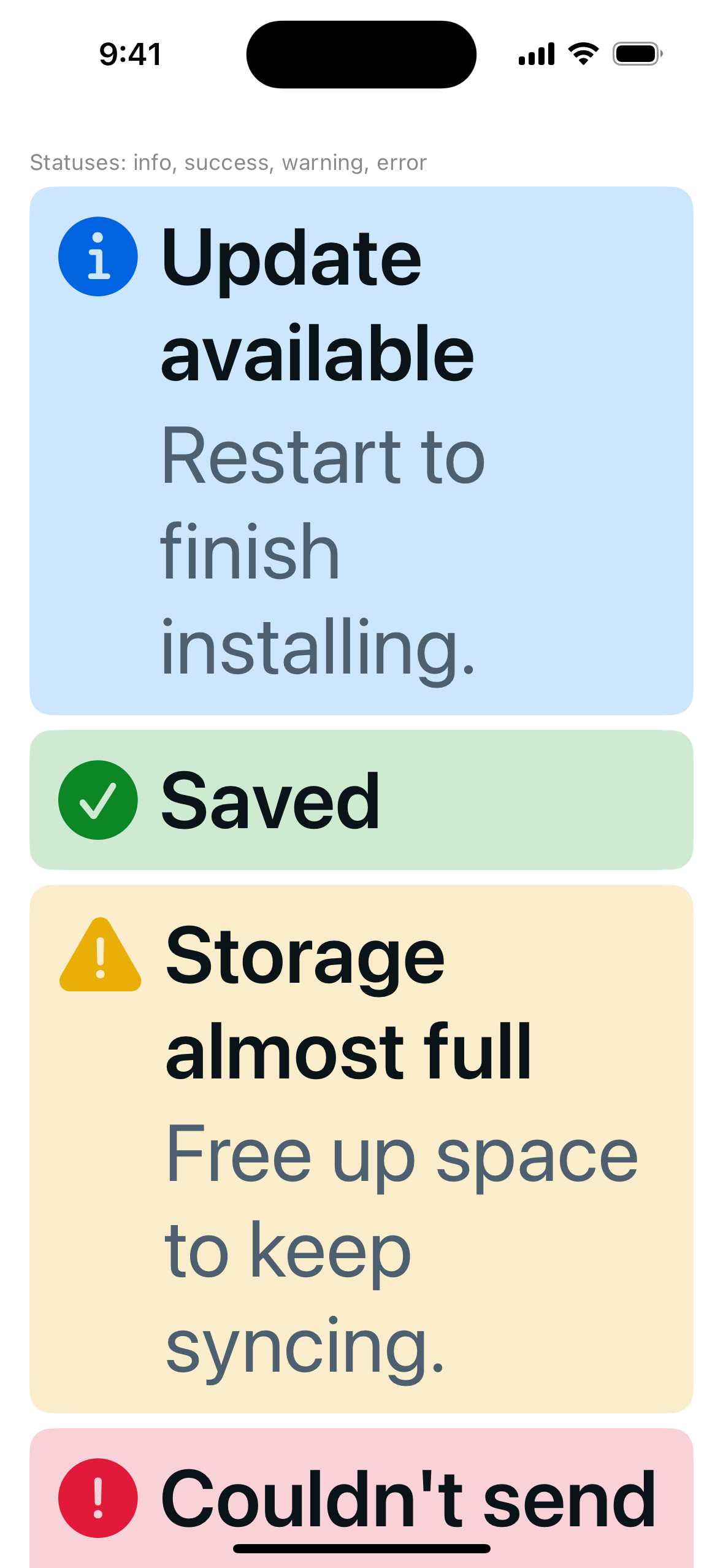
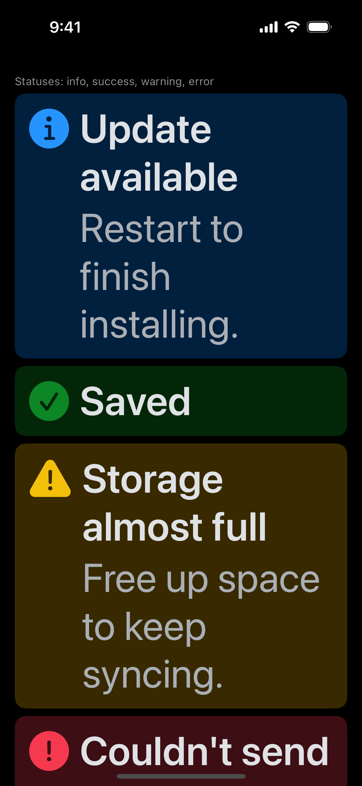
**Banner** (statuses; two themes):

<img src="https://raw.githubusercontent.com/cixzhang/astryx-pixel-gallery/27f10ad1a94648b64447aba2a1ec79bfe79c13c3/pr-shots/8310/Banner-light-large.png" width="150"> <img src="https://raw.githubusercontent.com/cixzhang/astryx-pixel-gallery/27f10ad1a94648b64447aba2a1ec79bfe79c13c3/pr-shots/8310/Banner-dark-large.png" width="150"> <img src="https://raw.githubusercontent.com/cixzhang/astryx-pixel-gallery/27f10ad1a94648b64447aba2a1ec79bfe79c13c3/pr-shots/8310/Banner-light-ax5.png" width="150"> <img src="https://raw.githubusercontent.com/cixzhang/astryx-pixel-gallery/27f10ad1a94648b64447aba2a1ec79bfe79c13c3/pr-shots/8310/Banner-dark-ax5.png" width="150">

## Testing

- Swift tests:
  - both initializers build the same props;
  - an interruptible loading button takes presses, and a plain loading one does not;
  - `href` makes an enabled button a link and a disabled one a button;
  - a loading link stays a link and accepts no press, and an interruptible loading link opens;
  - every disabled Button keeps its focus stop and takes no press;
  - `javascript:`, `vbscript:`, and `data:text/html` destinations never open and leave an enabled button, while `data:image` and `mailto:` still open;
  - `fill` takes the whole width, in pixels;
  - elevation reads the theme's shadows;
  - Banner's typed colors;
  - the existing loading, disabled, 44-point, and Dynamic Type tests.
- `swiftc -typecheck` of both modules, the tests, and the templates passes; the Swift tests run in CI on the iOS Simulator.

Every changed file is under `packages/native/`.


What changes for people
An iOS developer gets core's whole TextInput, with each option working the way core defines it:
onEnter);People using VoiceOver hear the field's name and note with any error in the label (SwiftUI has no invalid state, and a hint is skipped with Speak Hints off), then the description, other status messages, "Read only", and the disabled reason; the shown description and status message are also their own text in the reading order. Announcements and autofocus happen on the field's first appearance, not each time it scrolls back into view. A status message that appears or changes is announced, an error at once. A read-only password stays masked. On a touch screen, a tap opens what hover opens with a pointer, and the small buttons (clear, tips) answer taps across 44 points without growing the field.
What this does
TextInputtakes the generatedTextInputProps(AST-093 FR5; Swift component API A2, A3, A5):valueandonChangeas the contract types them, not aBinding, plus a labeled initializer that builds the same props.isDisabledwins overisReadOnly, as in core.TooltipFocus.inside, tracking the drawn field's focus, as Thumbnail does), on hover, and on a tap; VoiceOver reads it on the field.onEnter, as core's read-only input does. A password stays masked and cannot be selected. VoiceOver reads "Read only" (core's catalog message for controls that cannot expose read-only).isOptionalwins overisRequired, as in core.aria-disabled), and a reason shows in the shared Astryx tooltip on hover, keyboard focus, and a tap.accessibilityRepresentation): a text field, dimmed when disabled, a secure field for a password, with "Read only" or the disabled reason in its description. SwiftUI's own text field cannot be read-only, and a disabled one takes no focus (AST-093 FR2).onChangeonly while the field can be edited.onEnteruses SwiftUI's submit, which never fires while an input method is composing.library/tooltip.spec.md) on hover, keyboard focus (each is a tab stop), and a tap; the clear button shows "Clear" on hover and focus. No view uses.help.idandisHiddenapply to the control, core's base target for TextInput:idis its accessibility identifier, andisHiddentakes the control and its buttons out of layout and focus (autofocus included) while the label, description, and status stay.Optional,Required,Read only,Clear {label},Clear,Loading, and the status buttons' names. The strings generator carries these messages. A locale whose catalog lacks a message falls back to English, as core does at run time; English must have every message.valueandonChange.Lands after #8303 (Text and Heading props) and #8299 (the Astryx names), which this branch builds on.
Captures (AST-093 FR5)
iPhone 16 simulator, iOS 18.5, Xcode 16.4, built from
5f854e2, which has the theme's status roles (border, icon, and on-muted message text) and the one-line drawn value; the head since drops only the Login template's Return action. Four screens, so every state has its own capture at the default text size (light, dark) and at the largest (AX5, top and end):sizes and placeholder; required, optional, description, label tip, clear
attached error, warning, and success statuses
detached status; status in a tip with clear; loading
read-only, read-only password, empty read-only with its placeholder; disabled with a reason, disabled, hidden label with its description hidden, both notes
Not measured: a tooltip or announcement while showing, which a still capture cannot open, and keyboard focus.
Compatibility: breaking for canary callers, since
valueandonChangereplace theBinding.Spec record
New draft record
component:swift/TextInput(packages/native/apple/Sources/Astryx/TextInput/TextInput.spec.md). FR1–FR5 cover the initializers and edits, the drawn read-only and disabled field, the error in the label and announcements, tips through the shared tooltip with separate 44-point targets, and base props on the control. AV1 names the fields considered for read-only and disabled (SwiftUITextField/SecureField, UIKitUITextFieldrefusing edits, AppKitNSTextFieldread-only) and why none fits both platforms.Writing rubric results
Testing
onChangeonly while editable;pnpm vitest run --project node packages/native/src/theme: the strings tests (new messages, English fallback, drift) pass.swiftc -typecheckof both modules, the tests, and the templates passes; the Swift tests run in CI on the iOS Simulator.Every changed file is under
packages/native/.